DImodelsVis with DImodels objects
DImodelsVis-with-DImodels-objects.RmdThis vignette describes how visualisations from
DImodelsVis can be generated using model objects fit with
the DImodels
R package. All visualisations shown here are generated using the
respective wrapper functions for a model object with class
DI, which automatically apply sensible defaults for most
parameters. For situations when users desire finer control of the
visualisation pipeline or if their models objects can’t be fit using
DImodels, see the
vignette("DImodelsVis-with-complex-models", package = "DImodelsVis").
Data exploration
Loading and filtering the dataset
# Data
data("Switzerland")

# Filter out subset of data to be used for modelling
model_data <- Switzerland %>%
  # Only considering communities that recieved 150 kg Nitrogen
  filter(nitrogen == "150") %>%
  # Giving informative names to the grasses and legumes
  rename("G1" = p1, "G2" = p2, "L1" = p3, "L2" = p4)

head(model_data)
#>   plot nitrogen density   G1   G2   L1   L2    yield
#> 1    1      150    high 0.70 0.10 0.10 0.10 13.51823
#> 2    2      150    high 0.10 0.70 0.10 0.10 13.16549
#> 3    3      150    high 0.10 0.10 0.70 0.10 19.95682
#> 4    4      150    high 0.10 0.10 0.10 0.70 17.93976
#> 5    5      150    high 0.25 0.25 0.25 0.25 13.74719
#> 6    6      150    high 0.40 0.40 0.10 0.10 15.11899
Visualisations for data exploration
We create some preliminary visualisations for exploring the data.
Pie-glyph scatterplot
The gradient_change_data() and
gradient_change_plot() functions in
DImodelsVis can be used to generate pie-glyph scatterplots
to illustrate any patterns between the response and compositional
predictors (species proportions in this case).
# Name of compositional predictors (species)
species <- c("G1", "G2", "L1", "L2")
# Functional groupings of species
FG <- c("Gr", "Gr", "Le", "Le")
# Colours to be used for pie-glyphs for all figures
pie_cols <- get_colours(vars = species, FG = FG)

# Gradient_change_data function from DImodelsVis adds values of popular diversity indices such as Richness and evenness for each community to the data.
gradient_change_data(model_data, prop = species,
                     # Prediction = FALSE because we are working with raw data and don't need predictions
                     prediction = FALSE) %>%
    # The created data can be passed to the gradient_change_plot data to create the visualisation
    gradient_change_plot(y_var = "yield",         # Variable to show on y-axis
                         pie_colours = pie_cols,  # Colours for pie-glyphs slices
                         pie_radius = 0.3)        # Radius of pie-glyphs
#> ✔ Finished data preparation
#> ✔ Created plot.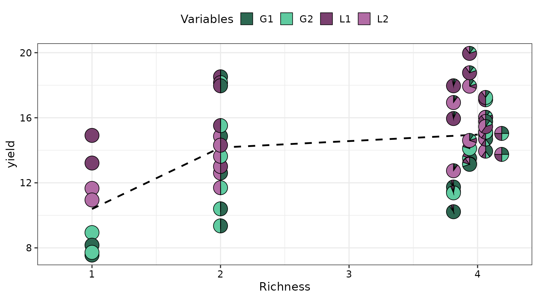
Boxplots for DM yield vs seeding density
The DM yield does not seem to be affected by seeding density.
ggplot(data = model_data, aes(x = density, y = yield)) +
  geom_boxplot(fill = "steelblue2") +
  theme_DI()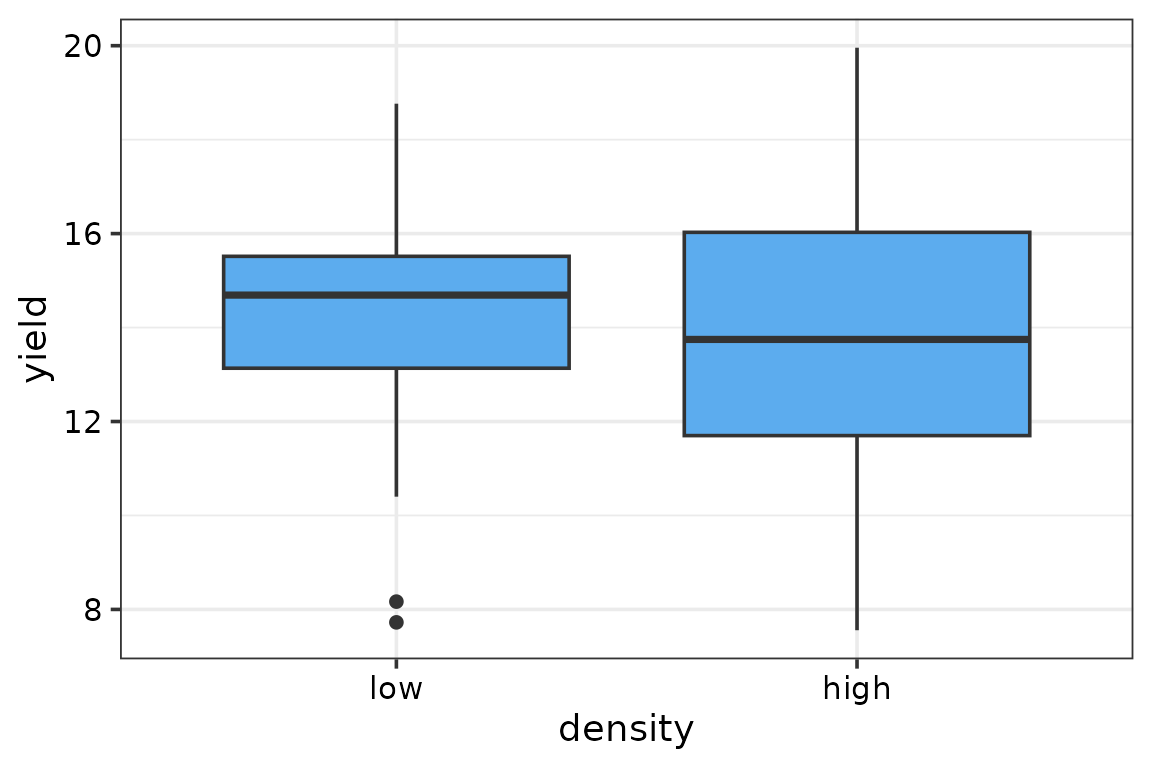
Model fitting and selection
Fitting models
We fit five different DI models to this data. Each with a different structure for the interactions between species.
- Identities only (ID) DI model (No interaction terms for species)
- Average pairwise interaction (AV) DI model (single interaction term for all species)
- Functional group (FG) DI model (species interactions are dictated by functional group membership)
- Additive species interaction (ADD) DI model (every species interacts with all others in the same way)
- Full pairwise interaction (FULL) DI model (separate pairwise interaction for each pair of species)
These models can be fit using the DImodels R package by
setting the DImodel parameter in the DI()
function to the respective structure.
# DI Models

# Identities only DI model (No interaction terms for species)
model_ID <- DI(y = "yield",       # Name of column containing the response variable
               prop = species,    # Names of columns containing the species proportions
               FG = FG,           # Functional grouping of the species
               DImodel = "ID",    # Type of DI model to fit (this will change for other models)
               theta = 1,         # Value of theta to be used for the model.
               data = model_data) # Variable containing the data
#> Fitted model: Species identity 'ID' DImodel
model_ID
#>
#> Call:  glm(formula = fmla, family = family, data = data)
#>
#> Coefficients:
#> G1_ID  G2_ID  L1_ID  L2_ID
#> 11.52  11.77  18.51  14.36
#>
#> Degrees of Freedom: 50 Total (i.e. Null);  46 Residual
#> Null Deviance:       10290
#> Residual Deviance: 257.9     AIC: 233.9

# Average pairwise interaction DI model (single interaction term for all species)
model_AV <- DI(y = "yield", prop = species, FG = FG,
               DImodel = "AV", theta = 1, data = model_data)
#> Fitted model: Average interactions 'AV' DImodel
model_AV
#>
#> Call:  glm(formula = fmla, family = family, data = data)
#>
#> Coefficients:
#>  G1_ID   G2_ID   L1_ID   L2_ID      AV
#>  8.816   9.068  15.807  11.651  13.033
#>
#> Degrees of Freedom: 50 Total (i.e. Null);  45 Residual
#> Null Deviance:       10290
#> Residual Deviance: 136.4     AIC: 204.1

# Functional group DI model (species interactions are dictated by functional group membership)
model_FG <- DI(y = "yield", prop = species, FG = FG,
               DImodel = "FG", theta = 1, data = model_data)
#> Fitted model: Functional group effects 'FG' DImodel
model_FG
#>
#> Call:  glm(formula = fmla, family = family, data = data)
#>
#> Coefficients:
#>        G1_ID         G2_ID         L1_ID         L2_ID  FG_bfg_Gr_Le
#>        8.541         8.793        16.082        11.926        17.382
#>    FG_wfg_Gr     FG_wfg_Le
#>        7.660         1.012
#>
#> Degrees of Freedom: 50 Total (i.e. Null);  43 Residual
#> Null Deviance:       10290
#> Residual Deviance: 101.9     AIC: 193.5

# Additive species interaction DI model (every species interacts with all others in the same way)
model_ADD <- DI(y = "yield", prop = species, FG = FG,
                DImodel = "ADD", theta = 1, data = model_data)
#> Fitted model: Additive species contributions to interactions 'ADD' DImodel
model_ADD
#>
#> Call:  glm(formula = fmla, family = family, data = data)
#>
#> Coefficients:
#>   G1_ID    G2_ID    L1_ID    L2_ID   G1_add   G2_add   L1_add   L2_add
#>  8.3780   8.9552  15.2298  12.7790   9.1606   7.1969  10.0048  -0.2959
#>
#> Degrees of Freedom: 50 Total (i.e. Null);  42 Residual
#> Null Deviance:       10290
#> Residual Deviance: 121.7     AIC: 204.4

# Full pairwise interaction DI model (separate pairwise interaction for each pair of species)
model_FULL <- DI(y = "yield", prop = species, FG = FG,
                 DImodel = "FULL", theta = 1, data = model_data)
#> Fitted model: Separate pairwise interactions 'FULL' DImodel
model_FULL
#>
#> Call:  glm(formula = fmla, family = family, data = data)
#>
#> Coefficients:
#>   G1_ID    G2_ID    L1_ID    L2_ID  `G1:G2`  `G1:L1`  `G1:L2`  `G2:L1`
#>   8.378    8.955   15.230   12.779    7.660   23.647   13.080   21.417
#> `G2:L2`  `L1:L2`
#>  11.383    1.012
#>
#> Degrees of Freedom: 50 Total (i.e. Null);  40 Residual
#> Null Deviance:       10290
#> Residual Deviance: 89.69     AIC: 193.1
Model selection
The model_selection() function in
DImodelsVis can be used to generate figures showing
comparisons of information criteria for different models. It is also
possible to visualise a breakup of the information criteria into
deviance (goodness-of-fit) and penalty terms for each model. This could
aid with model selection and help understand why a parsimonious model
could be preferable over a more complex model.
In this example we first generate a line plot in panel (a) showing
AICc values for the five models fit above. Additionally,
the breakup of the AICc value for each model into deviance
and penalty terms (generated by setting breakup = TRUE in
model_selection()) is shown in panel (b).
# Store all fitted models in a list
mods_list <- list("ID_mod" = model_ID,
"AV_mod" = model_AV,
"FG_mod" = model_FG,
"ADD_mod" = model_ADD,
"FULL_mod" = model_FULL)
# Create a plot showing AICc values for each model
panel_a <- model_selection(models = mods_list, metric = "AICc")
# Create same plot but AICc value is split into the deviance and penalty components
panel_b <- model_selection(models = mods_list, metric = "AICc", breakup = TRUE)
# Combine the two plots into one
plot_grid(panel_a, panel_b,
labels = c("(a)", "(b)"))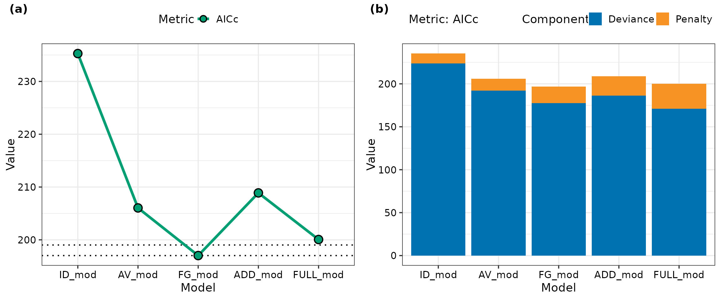 The functional group (FG) model has the lowest
 AICc value.
The dotted lines around the FG model indicate the region within two
units of the lowest AICc and models with AICc
values within this band have comparable performance. The full pairwise
(FULL) model lies close to this region, however, we still prefer the FG
model as it is more parsimonious due to having fewer coefficients. This
is further clarified in panel (b), which shows that the FG model has a
lower AICc than the full model due to having a smaller
penalty component.
Coefficients for selected model
We use create the summary table and a dot and whisker plot for the coefficients from our selected model.
# Store selected model in new object
model <- model_FG

# Create summary table for model coefficients
summary(model)
#>
#> Call:
#> glm(formula = fmla, family = family, data = data)
#>
#> Coefficients:
#>              Estimate Std. Error t value Pr(>|t|)
#> G1_ID          8.5406     0.7627  11.198 2.50e-14 ***
#> G2_ID          8.7926     0.7627  11.528 9.70e-15 ***
#> L1_ID         16.0825     0.7627  21.086  < 2e-16 ***
#> L2_ID         11.9263     0.7627  15.637  < 2e-16 ***
#> FG_bfg_Gr_Le  17.3817     2.1713   8.005 4.66e-10 ***
#> FG_wfg_Gr      7.6604     4.4234   1.732   0.0905 .
#> FG_wfg_Le      1.0119     4.4234   0.229   0.8201
#> ---
#> Signif. codes:  0 '***' 0.001 '**' 0.01 '*' 0.05 '.' 0.1 ' ' 1
#>
#> (Dispersion parameter for gaussian family taken to be 2.370592)
#>
#>     Null deviance: 10290.75  on 50  degrees of freedom
#> Residual deviance:   101.94  on 43  degrees of freedom
#> AIC: 193.51
#>
#> Number of Fisher Scoring iterations: 2

# Dot-whisker plot for model coefficients
# Create data
summary(model)$coefficients %>%
  as.data.frame() %>%
  mutate(Term = factor(rownames(.), levels = rev(rownames(.))),
         # CI estimates
         conf.low = Estimate - 1.96 * `Std. Error`,
         conf.high = Estimate + 1.96 * `Std. Error`,
         # Stars based on p-values
         p.stars = case_when(
            `Pr(>|t|)` < 0.001 ~ "***",
            `Pr(>|t|)` < 0.01  ~ "**",
            `Pr(>|t|)` < 0.05  ~ "*",
            `Pr(>|t|)` < 0.1   ~ ".",
            TRUE      ~ ""
         ),
         p.label = paste(round(Estimate, 2), p.stars)) %>%
  # Create plot
  ggplot(data = ., aes(x = Estimate, y = Term)) +
    # Dot and whisker
    geom_pointrange(aes(xmin = conf.low, xmax = conf.high),
                    colour = "#333333", linewidth = 0.75) +
    # Coefficients estimates and significance
    geom_label(aes(label = p.label), fill = NA, size = 4,
               text.colour = "#333333", border.colour = NA,
               vjust = 0.25, label.padding = unit(1.25, "lines")) +
    # Adjust x-axis labels
    scale_x_continuous(breaks = seq(-10, 25, 5)) +
    # Add vertical line at x = 0
    geom_vline(xintercept = 0, linewidth = 1,
               linetype = "dashed", colour = "tomato3") +
    # Theme for plot
    theme_DI() +
    # labels
    labs(x = "Estimates", y = "Term", subtitle = "Response: yield")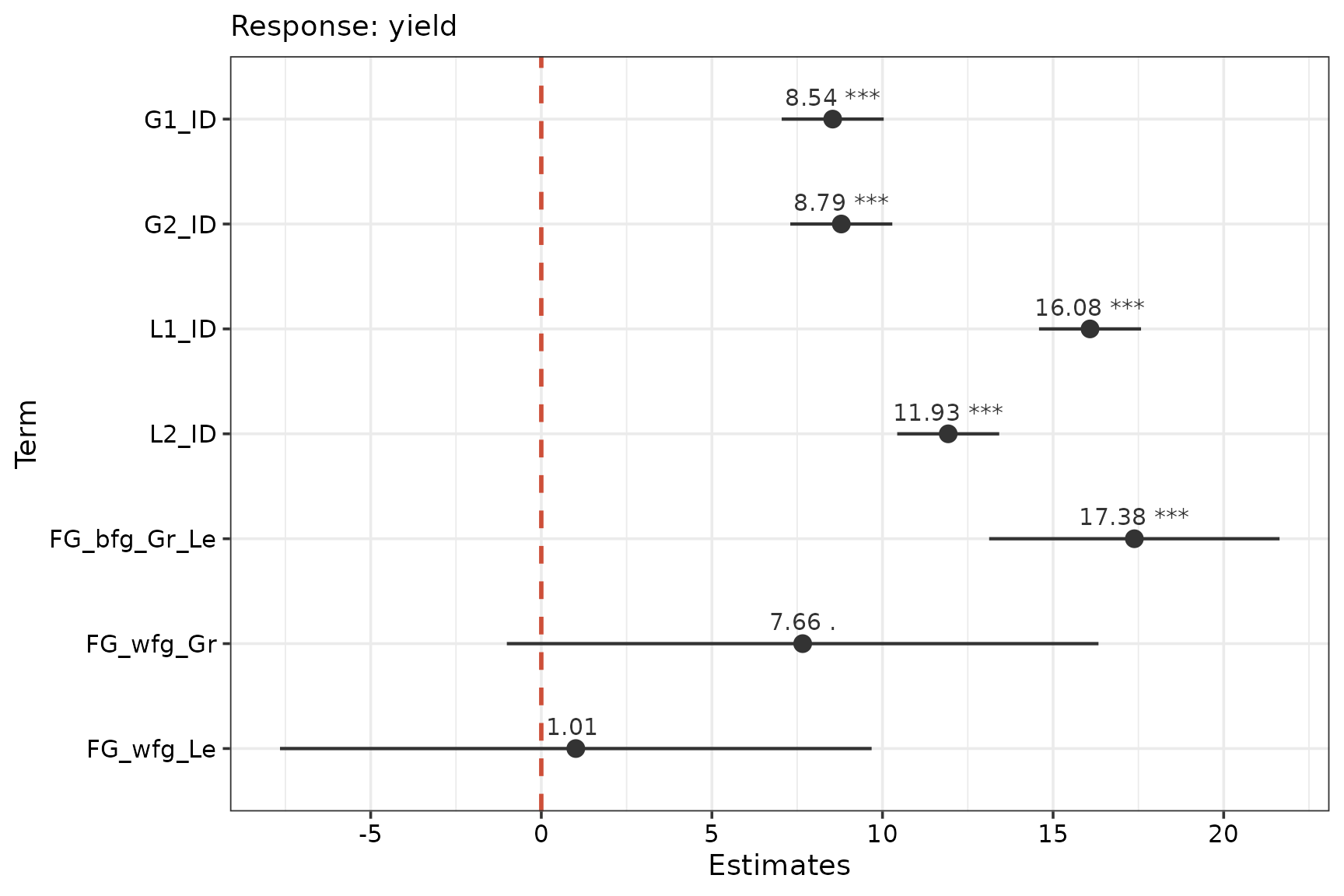
The grasses have lower identity effects (G1_ID and
G2_ID) than the legumes (L1_ID and
L2_ID). The grass-grass (FG_wfg_Gr) and
legume-legume (FG_wfg_Le) interaction terms are
insignificant at the
level. The grass-legume interaction (FG_bfg_Gr_Le) is quite
strong.
Visualisations
Model diagnostics
The model_diagnostics() and theme_DI()
functions from DImodelsVis are used along with additional
helper functions from ggplot2 to improve the plot
aesthetics.
model_diagnostics(model = model, pie_radius = 0.275) +
  # ggplot2 helper functions
  # Legend title and colours
  scale_fill_manual(values = pie_cols, name = "Species") +
  # Theme for plot
  theme_DI(font_size = 16)
#> ✔ Created all plots.
#> Scale for fill is already present.
#> Adding another scale for fill, which will replace the existing scale.
#> Scale for fill is already present.
#> Adding another scale for fill, which will replace the existing scale.
#> Scale for fill is already present.
#> Adding another scale for fill, which will replace the existing scale.
#> Scale for fill is already present.
#> Adding another scale for fill, which will replace the existing scale.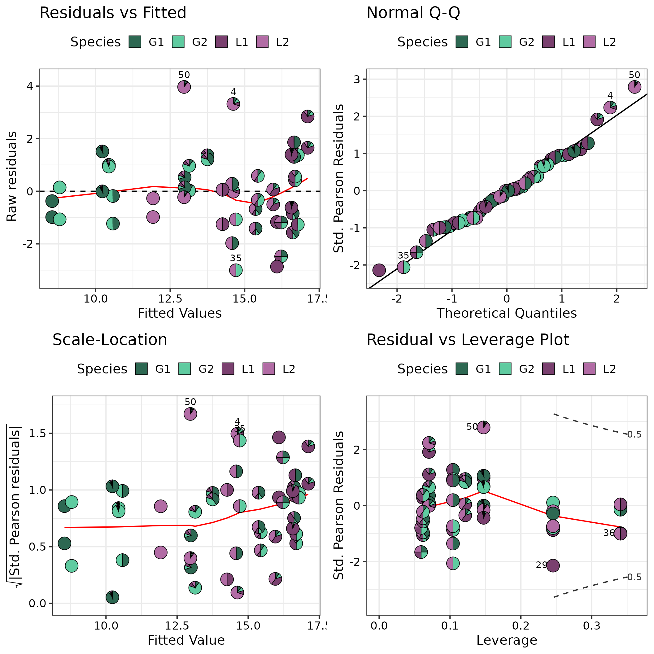
Prediction contributions
The get_equi_comms() function from
DImodelsVis is used for preparing the communities to be
shown in the figure while the prediction_contributions()
and theme_DI() functions from DImodelsVis are
used to generate the plot. Finally, additional helper functions from
ggplot2 to improve the plot aesthetics.
# Create a data-frame containing all equi-proportional communities containing one up to four species (helper function available in DImodelsVis)
pred_data <- get_equi_comms(4, variables = c("G1", "G2", "L1", "L2")) %>%
  mutate("Rich." = paste0("Rich. = ", Richness))

# Create plot
prediction_contributions(
             # Model object and data.frame containing observations for which to predict for
             model = model, data = pred_data,
             # Add colours for the bar segments
             colours = c(pie_cols,
                         "steelblue4", "yellow2", "#909090"),
             # Labels for the bars
             bar_labs = c("G1_mono", "G2_mono", "L1_mono", "L2_mono",
                          "G1-G2", "G1-L1", "G1-L2", "G2-L1", "G2-L2", "L1-L2",
                          "G1-G2-L1", "G1-G2-L2", "G1-L1-L2", "G2-L1-L2",
                          "Centroid"),
             # Labels for legend keys
             groups = list("G1" = 1, "G2" = 2,
                           "L1" = 3, "L2" = 4,
                           "Grass-Grass" = 6,
                           "Legume-Legume" = 7,
                           "Grass-Legume" = 5)) +
  # ggplot2 helper functions
  # Group mixtures at each level of richness together in a single panel
  facet_grid(~ Rich., space = "free_x",
             scales = "free_x") +
  # Labels
  labs(y = "Predicted yield (t/ha)") +
  # Rotate x-axis labels
  theme(axis.text.x = element_text(angle = 90, vjust = 0.5, hjust = 1))
#> ✔ Finished data preparation.
#> ✔ Created plot.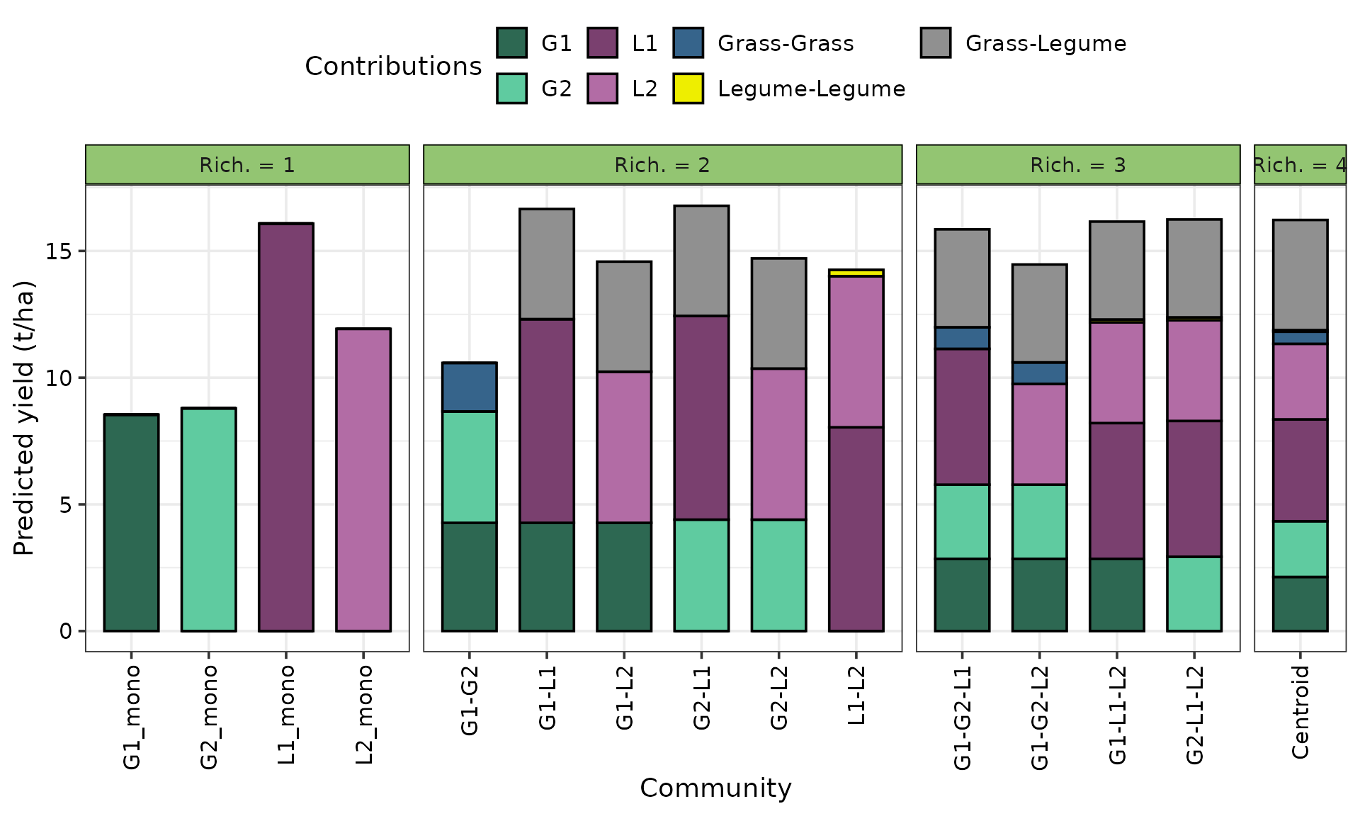
Conditional ternary plot
We create conditional ternary diagrams showing the response surface when is conditioned to be at values of 0, 0.25, and 0.5, while the remaining three species are allowed to vary between . An interactive version of the conditioned slices embedded in a 3d tetrahedron is also shown later in panel (b) to help with interpretation.
Code for conditional ternary diagrams
conditional_ternary(# Model object
                    model = model,
                    # Name of predictors to be shown inside the ternary
                    tern_vars = c("G1", "G2", "L2"),
                    # Name and values for predictor(s) to be conditioned on
                    conditional = data.frame(L1 = c(0, 0.25, 0.5)),
                    # Don't print labels on contour lines
                    contour_text = FALSE,
                    # Low numbers means fewer points but mean faster execution
                    resolution = 1,
                    # Upper limit on legend
                    upper_lim = 18,
                    # Lower limit on legend
                    lower_lim = 8,
                    # Size of labels
                    axis_label_size = 5,
                    # Number of contours
                    nlevels = 8) +
  # ggplot2 helper functions
  # Panel and legend title
  labs(subtitle = "(a)",
       fill = "Predicted\nyield (t/ha)") +
  # Label position
  theme(plot.subtitle = element_text(size = 16, hjust = 0))
#> ✔ Finished data preparation.
#> ✔ Created plot.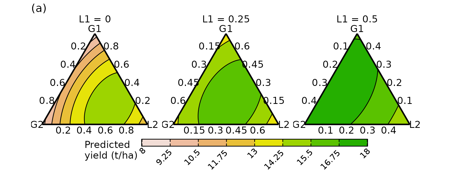
Code for interactive tetrahedron with conditional ternary slices embedded
All code for interactive tetrahedron is presented at the end of the document after all the example visualisations.
The tetrahedron with slices from the above figure embedded inside is
created using plotly. We first generate the data containing
the respective slices using the conditional_ternary_data()
function from DImodelsVis and pass it to the helper
function we created above to generate the interactive 3d tetrahedron
with the slices embedded within.
# Create data for the three slices to be shown within the 3d tetrahedron.
# Use the conditional_ternary_data function from DImodels for preparing the data.
plot_data_cond <- conditional_ternary_data(
# Model object
model = model,
# Don't add predictions (only create skeleton data)
prediction = FALSE,
# Quantity of points to generate for response surface
# Low numbers means fewer points but mean faster execution
resolution = 0.3,
# Name of compositional predictors
prop = species,
# Name of predictors to be shown inside the ternary
tern_vars = c("G1", "G2", "L2"),
# Name and values for predictor(s) to be conditioned on
conditional = data.frame("L1" = c(0, 0.25, 0.5))) %>%
# Manually add predictions for entire data at the end
add_prediction(model)
#> ✔ Finished data preparation.
# Create the 3d tetrahedron with response surface for the slices shown the conditional ternary
plot_tetra(data = plot_data_cond,
prop = species,
upper_lim = 18, lower_lim = 8, nlevels = 8) %>%
layout(title = list(text = "(b)",
font = list(size = 18),
xanchor = "left",
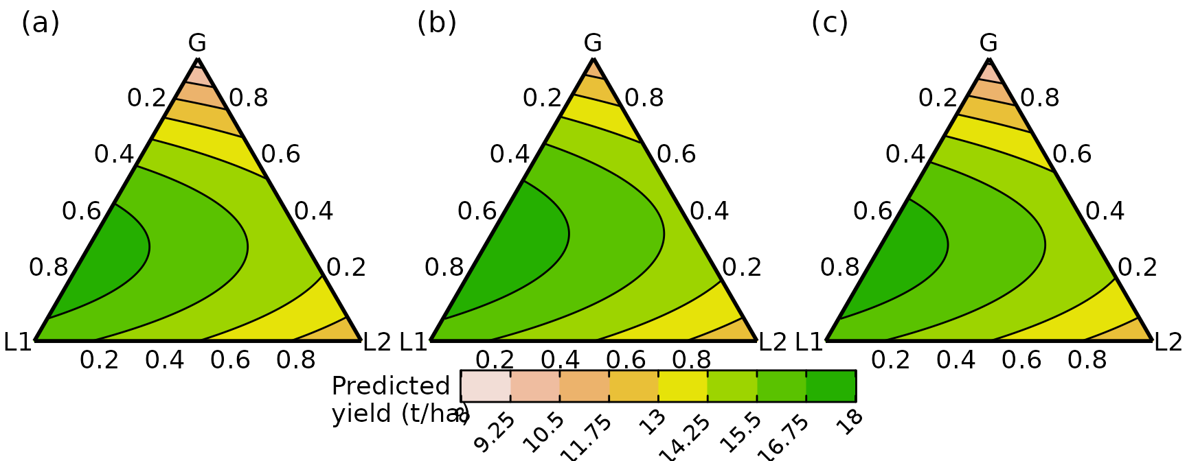
yanchor = "top", x = 0.1, y = 0.95))Grouped ternary plot
The grouped_ternary() function from
DImodelsVis is used to generate the grouped ternary
diagrams. Unlike conditional ternaries, a separate ternary is generated
for each setting and thus they are all combined in a single plot with a
common legend using the plot_grid() function from
cowplot. We create grouped ternary diagrams showing the
response surface when the two grasses
and
are grouped together in splits of 1:0, 0.5:0.5, and 0:1 while the
legumes are left untouched, in panels (a), (b), and (c), respectively.
An interactive version of the conditioned slices embedded in a 3d
tetrahedron is also shown later in panel (d) to help with
interpretation.
# Gr = 100% G1 and 0% G2 (see values parameter)
g1 <- grouped_ternary(model = model, contour_text = FALSE,
                      # Grouping of compositional variables
                      FG = c("G", "G", "L1", "L2"),
                      # Low numbers means fewer points but mean faster execution
                      resolution = 1,
                      # Split of species within each group
                      values = c(1, 0, 1, 1),
                      axis_label_size = 5, nlevels = 8,
                      upper_lim = 18, lower_lim = 8)
#> ✔ Finished data preparation.
#> ✔ Created plot.

# Gr = 50% G1 and 50% G2 (see values parameter)
g2 <- grouped_ternary(model = model, contour_text = FALSE,
                      # Grouping of compositional variables
                      FG = c("G", "G", "L1", "L2"),
                      # Low numbers means fewer points but mean faster execution
                      resolution = 1,
                      # Split of species within each group
                      values = c(0.5, 0.5, 1, 1),
                      axis_label_size = 5, nlevels = 8,
                      upper_lim = 18, lower_lim = 8)
#> ✔ Finished data preparation.
#> ✔ Created plot.

# Gr = 0% G1 and 100% G2 (see values parameter)
g3 <- grouped_ternary(model = model, contour_text = FALSE,
                      # Grouping of compositional variables
                      FG = c("G", "G", "L1", "L2"),
                      # Low numbers means fewer points but mean faster execution
                      resolution = 1,
                      # Split of species within each group
                      values = c(0, 1, 1, 1),
                      axis_label_size = 5, nlevels = 8,
                      upper_lim = 18, lower_lim = 8)
#> ✔ Finished data preparation.
#> ✔ Created plot.

# Combine all three ternaries into a single plot
# Can use any of the popular packages such as cowplot or patchwork
plot_grid(
  # First combine the three ternaries without any legend
  plot_grid(g1 + theme(legend.position = "none"),
            g2 + theme(legend.position = "none"),
            g3 + theme(legend.position = "none"),
            # aesthetic adjustments
            labels = c("(a)", "(b)", "(c)"), label_size = 16,
            label_fontface = "plain", nrow = 1),
  # Add a single common legend for all three ternaries
  get_plot_component(g1 + labs(fill = "Predicted\nyield (t/ha)"),
                     "guide-box", return_all = TRUE),
  ggplot() + theme_void(), labels = c("", "", ""), label_size = 18,
  ncol = 1, rel_heights = c(1, 0.1, 0.05)
)
Code for interactive tetrahedron with grouped ternary slices embedded
The tetrahedron with slices from above figure embedded inside is
created using plotly. We first generate the data containing
the respective slices using the grouped_ternary_data()
function from DImodelsVis and pass it to the helper
function we created above to generate the interactive 3d tetrahedron
with the slices embedded within.
# Create data for the three slices to be shown within the 3d tetrahedron.
# Use the grouped_ternary_data function from DImodels for preparing the data.
plot_data_group <- lapply(list(c(1, 0, 1, 1), c(0.5, 0.5, 1, 1), c(0, 1, 1, 1)),
                          function(x){
                            grouped_ternary_data(model = model,
                                                 prop = species,
                                                 FG = c("Gr", "Gr", "L.1", "L.2"),
                                                 values = x,
                                                 resolution = 0.3,
                                                 prediction = FALSE) %>%
                              mutate(.Group = x[1])
                          }) %>%
  bind_rows() %>%
  # Manually add predictions for entire data at the end
  add_prediction(model)
#> ✔ Finished data preparation.
#> ✔ Finished data preparation.
#> ✔ Finished data preparation.

# Create the 3d tetrahedron with response surface for the slices shown in Figures 9a, 9b, and 9c
plot_tetra(data = plot_data_group, prop = species,
           upper_lim = 18, lower_lim = 8, nlevels = 8) %>%
  layout(title = list(text = "(d)",
                      font = list(size = 18),
                      xanchor = "left",
                      yanchor = "top", x = 0.1, y = 0.95))
Response variation along a path across simplex space
The simplex_path() function from
DImodelsVis is used to generate Figure 9a of the main
manuscript depicting the change in predicted yield as we move from the
four-species centroid mixture to each of the two species binary
equi-proportional mixtures. By default, the figure is created with black
coloured curves for each path, however, we have used additional
ggplot2 code to colour the curves so they can be connected
to those shown in the interactive tetrahedron shown later.
# The centroid community (starting point for the straight line)
starts <- tribble(~G1,     ~G2,   ~L1,  ~L2,
                    0.25, 0.25, 0.25, 0.25)

# The six binary mixtures (ending points for the straight lines)
ends <- tribble(~G1,    ~G2,  ~L1,  ~L2,
                  0.5,  0.5,    0,    0,
                  0.5,    0,  0.5,    0,
                  0.5,    0,    0,  0.5,
                    0,  0.5,  0.5,    0,
                    0,  0.5,    0,  0.5,
                    0,    0,  0.5,  0.5)

# Create the visualisation
fig10 <- simplex_path(model = model,
                      # Starting compositions
                      starts = starts,
                      # Ending compositions
                      ends = ends,
                      # pie-glyphs at values 0, 0.5, and 1 of interpolation factor
                      pie_positions = c(0, 0.5, 1),
                      # Don't show uncertainty bands
                      se = FALSE,
                      # Radius of pie-glyphs
                      pie_radius = 0.3)
#> ✔ Finished data preparation.
#> ✔ Created plot.

# Modify the plot aesthetics to colour the individual paths, so they can be matched with those in the interactive tetrahedron
fig10 +
  # Add coloured lines
  geom_line(aes(colour = as.factor(.Group)), linewidth = 1) +
  # Overlay pie-glyphs on top of the lines
  fig10$layers[[2]] +
  # Legend to be shown in two rows
  guides(fill = guide_legend(nrow = 2)) +
  # Colours for the lines
  scale_color_manual(values = c("#7570B3", "#E7298A", "#66A61E", "#E6AB02", "#009E73", "#A6761D")) +
  # Theme for plot
  theme_DI(font_size = 16) +
  # Labels
  labs(colour = "Curve",
       y = "Predicted yield (t/ha)",
       x = "Interpolation factor",
       subtitle = "(a)",
       fill = "Species") +
  # Adjust position of panel label (a)
  theme(plot.subtitle = element_text(size = 16,
                                     hjust = -0.065,
                                     vjust = -7))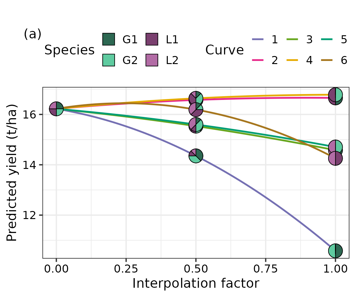
Code for interactive tetrahedron with simplex paths embedded inside
An interactive tetrahedron depicting the straight lines connecting
the respective points for curves shown in the above figure is created
using plotly. We first generate the data containing the
respective line segments and pass it to the helper function we created
above to generate the interactive 3d tetrahedron with the lines embedded
within.
# Create the data containing the starting and ending points for the six lines
lines_data <- bind_rows(starts, starts, starts, starts, starts, starts, ends) %>%
  mutate(ID = as.factor(rep(1:6, times = 2))) %>%
  arrange(ID)

# Create the six paths within the 4d simplex space (i.e., 3d tetrahedron)
plot_tetra_lines(lines_data, prop = species) %>%
  layout(title = list(text = "(b)",
                      font = list(size = 18),
                      xanchor = "left",
                      yanchor = "top", x = 0.1, y = 0.95))
Effects plot
The get_equi_comms() function from
DImodelsVis is used for preparing the communities to be
shown in the figure while the visualise_effects() and
theme_DI() functions from DImodelsVis are used
to generate the plot. Finally, additional helper functions from
ggplot2 to improve the plot aesthetics.
# Create a data-frame containing all equi-proportional communities containing one up to four species (helper function available in DImodelsVis)
eff_data <- get_equi_comms(4, variables = c("G1", "G2", "L1", "L2")) %>%
  mutate("Rich." = Richness)

# Create the visualisation
visualise_effects(model = model, data = eff_data) +
  # Aesthetic changes
  # Labels
  labs(y = "Predicted yield (t/ha)",
       fill = "Species") +
  # Theme for plot
  theme_DI(font_size = 16) +
  # Informative labels for each panel
  facet_wrap(~ .Sp,
             labeller = labeller(.Sp = paste("Species:", species) %>% `names<-`(species)))
#> • `var_interest` was not specified. Assuming all variables are of interest.
#> ✔ Finished data preparation.
#> ✔ Created plot.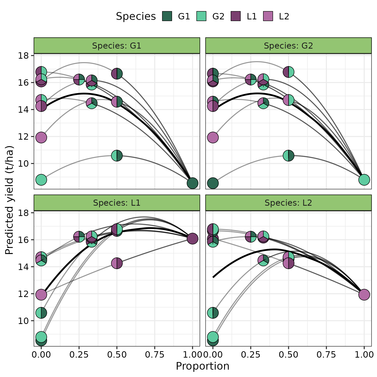
This is the additional code needed for visualising responses surfaces
of conditional ternaries within 3d tetrahedra to help with understanding
the plot. The code is hidden by default as it is long, click on
Show Code button to make it visible.
# Project 4d compositional data to 3d cartesian coordinates
# Code taken from the geozoo package
project_cartesian <- function(data){
   d <- dim(data)[2]
   helmert <- rep(1/sqrt(d), d)
   for (i in 1:(d - 1)) {
     x <- rep(1/sqrt(i * (i + 1)), i)
     x <- c(x, -i/sqrt(i * (i + 1)))
     x <- c(x, rep(0, d - i - 1))
     helmert <- rbind(helmert, x)
   }

   x <- data - matrix(1/d, dim(data)[1], d)
   return((x %*% t(helmert))[, -1])
}

# Adjust aesthetics for the 3d tetrahedron
# This will add themes, borders, hover labels, etc.
aesthetics <- function(temp, species, vertices){
  species <- sapply(species, function(x) {
    strsplit(x, "_")[[1]][1]
  })

  temp %>%
    layout(
      scene = list(
        # Fixing aspect ratio f
        aspectratio = list(
          x = 1,
          y = 1,
          z = 1
        ),
        # Hiding axes for better visibility
        xaxis = list(title = '', autorange = TRUE, showspikes = FALSE,
                     showgrid = FALSE, zeroline = FALSE, showline = FALSE,
                     autotick = TRUE, ticks = '', showticklabels = FALSE),
        yaxis = list(title = '', autorange = TRUE, showspikes = FALSE,
                     showgrid = FALSE, zeroline = FALSE, showline = FALSE,
                     autotick = TRUE, ticks = '', showticklabels = FALSE),
        zaxis = list(title = '', autorange = TRUE, showspikes = FALSE,
                     showgrid = FALSE, zeroline = FALSE, showline = FALSE,
                     autotick = TRUE, ticks = '', showticklabels = FALSE),
        # To allow for rotations in all degrees
        dragmode = "orbit",
        # # Display names of species on vertices
        annotations = list(list(
          showarrow = F,
          x = vertices$x[1],
          y = vertices$y[1],
          z = vertices$z[1],
          # To make labels bold
          text = paste0("<b>",species[1],"</b>"),
          xanchor = "left",
          xshift = 5,
          opacity = 1,
          font = list(color = 'black',
                      family = 'calibri',
                      size = 28)
        ), list(
          showarrow = F,
          x = vertices$x[2],
          y = vertices$y[2],
          z = vertices$z[2],
          text = paste0("<b>",species[2],"</b>"),
          xanchor = "left",
          xshift = 5,
          opacity = 1,
          font = list(color = 'black',
                      family = 'calibri',
                      size = 28)
        ), list(
          showarrow = F,
          x = vertices$x[3],
          y = vertices$y[3],
          z = vertices$z[3],
          text = paste0("<b>",species[3],"</b>"),
          xanchor = "left",
          xshift = 5,
          opacity = 1,
          font = list(color = 'black',
                      family = 'calibri',
                      size = 28)
        ), list(
          showarrow = F,
          x = vertices$x[4],
          y = vertices$y[4],
          z = vertices$z[4],
          text = paste0("<b>",species[4],"</b>"),
          xanchor = "left",
          xshift = 5,
          opacity = 1,
          font = list(color = 'black',
                      family = 'calibri',
                      size = 28)
        )
        )),
      # Background colour of legend
      legend = list(
        font = list(
          family = "calibri",
          size = 14,
          color = "#00000"),
        bgcolor = "#00000",
        itemsizing = "constant",
        bordercolor = "#000000",
        borderwidth = 3)
    )
}

# Create the tetrahedron with response surfaces for selected slices
plot_tetra <- function(data, prop, surface = TRUE,
                       lower_lim = NULL, upper_lim = NULL,
                       nlevels = 7){
  species <- data %>% dplyr::select(all_of(prop)) %>% colnames()

  # 3d projection of 4d species
  grid3d <- data.frame(project_cartesian(as.matrix(data[, prop])))
  colnames(grid3d) <- c('x','y','z')

  data <- cbind(data, grid3d)
  if(is.null(lower_lim)) lower_lim <- min(data$.Pred)
  if(is.null(upper_lim)) upper_lim <- max(data$.Pred)
  # Creating breaks for legend
  breaks <- seq(lower_lim, upper_lim, length.out = nlevels + 1)
  data$.CutPred <- cut(data$.Pred, breaks = breaks)

  # Getting position of vertices of tetrahedron
  vertex <- as.matrix(diag(4))
  colnames(vertex) <- species
  vertices <- data.frame(project_cartesian(vertex))
  colnames(vertices) <- c('x','y','z')
  vertices <- cbind(vertex, vertices)

  # Getting positions of edges of tetrahedron
  edges_index <- as.vector((combn(x=1:nrow(vertices), m=2)))
  edges <- vertices[edges_index,]

  # Create figure using plotly
  fig <- plot_ly(data, x = ~x, y = ~y, z=~z) %>%
    # Adding the points on 3d space
    add_trace(type='scatter3d', mode = 'markers', marker = list(size = 5),
              color = ~.CutPred, colors = terrain.colors(nlevels, rev = TRUE),
              showlegend = TRUE,
              hoverinfo = 'text', alpha=1,
              text = ~paste('</br> G1: ', round(get(species[1]),2),
                            '</br> G2: ', round(get(species[2]),2),
                            '</br> L1: ', round(get(species[3]),2),
                            '</br> L2: ', round(get(species[4]),2),
                            '</br> Pred: ', round(.Pred, 2))) %>%
    # Adding vertices and borders of tetrahedron
    add_trace(data= edges, type='scatter3d', mode = 'markers+lines',
              line = list(width = 5, color='black'),
              marker = list(size=5, color='blue'),
              showlegend=F,
              hoverinfo = 'text',
              text = ~paste('</br> G1: ', round(get(species[1]),2),
                            '</br> G2: ', round(get(species[2]),2),
                            '</br> L1: ', round(get(species[3]),2),
                            '</br> L2: ', round(get(species[4]),2))) %>%
    # Adjust aesthetics
    aesthetics(species = species, vertices = vertices)

  return(fig)
}

# Create tetrahedron with straight lines between pairs of points
plot_tetra_lines <- function(data, prop){
  species <- data %>% dplyr::select(all_of(prop)) %>% colnames()

  # 3d projection of 4d species
  grid3d <- data.frame(project_cartesian(as.matrix(data[, prop])))
  colnames(grid3d) <- c('x','y','z')

  data <- cbind(data, grid3d)

  # Getting position of vertices of tetrahedron
  vertex <- as.matrix(diag(4))
  colnames(vertex) <- species
  vertices <- data.frame(project_cartesian(vertex))
  colnames(vertices) <- c('x','y','z')
  vertices <- cbind(vertex, vertices)
  # Getting positions of edges of tetrahedron
  edges_index <- as.vector((combn(x=1:nrow(vertices), m=2)))
  edges <- vertices[edges_index,]

  cols <- c("#7570B3", "#E7298A", "#66A61E", "#E6AB02", "#009E73", "#A6761D")
  # Create plot with plotly
  fig <- plot_ly(data, x = ~x, y = ~y, z=~z)

  # Add individual lines with different colours
  for (id in unique(data$ID)){
      fig <- fig %>%
        add_trace(data = data %>% filter(ID == id),
                  type='scatter3d', mode = 'lines',
                  name = id,
                  line = list(width = 5, dash = "dashed",
                              color = cols[as.numeric(id)]),
                  hoverinfo = 'text',
                  text = ~paste('</br> G1: ', round(get(species[1]),2),
                                '</br> G2: ', round(get(species[2]),2),
                                '</br> L1: ', round(get(species[3]),2),
                                '</br> L2: ', round(get(species[4]),2)))
  }

  fig <- fig %>%
    # Add vertices and edges of tetrahedron
    add_trace(data= edges, type='scatter3d', mode = 'markers+lines',
              line = list(width = 5, color='black'),
              marker = list(size=5, color='blue'),
              showlegend=F,
              hoverinfo = 'text',
              text = ~paste('</br> G1: ', round(get(species[1]), 2),
                            '</br> G2: ', round(get(species[2]), 2),
                            '</br> L1: ', round(get(species[3]), 2),
                            '</br> L2: ', round(get(species[4]), 2))) %>%
    # Add points for end points of segments
    add_trace(data = data %>% distinct_at(species, .keep_all = TRUE),
              type='scatter3d', mode = 'markers',
              marker = list(size=5, color='#404040'),
              showlegend=F,
              hoverinfo = 'text',
              text = ~paste('</br> G1: ', round(get(species[1]), 2),
                            '</br> G2: ', round(get(species[2]), 2),
                            '</br> L1: ', round(get(species[3]), 2),
                            '</br> L2: ', round(get(species[4]), 2))) %>%
    # Adjust aesthetics
    aesthetics(species = species, vertices = vertices)

  return(fig)
}