Visualise change in response over diversity gradient
gradient_change_plot.RdHelper function for plotting the average (predicted) response at each level
of a diversity gradient. The output of the gradient_change_data
function should be passed here to visualise a scatter-plot of the predicted
response (or raw response) over a diversity gradient. The points can be overlaid
with `pie-glyphs` to show the relative
proportions of the compositional variables. The average change in any user-chosen
variable over the chosen diversity gradient can also be shown using the `y_var`
parameter.
Usage
gradient_change_plot(
  data,
  prop = NULL,
  pie_data = NULL,
  pie_colours = NULL,
  pie_radius = 0.25,
  points_size = 3,
  average = TRUE,
  y_var = ".Pred",
  facet_var = NULL,
  nrow = 0,
  ncol = 0
)
Arguments
- data
A data-frame which is the output of the `gradient_change_data` function, consisting of the predicted response averaged over a particular diversity gradient.
- prop
A vector of column names or indices identifying the columns containing the species proportions in the data. Will be inferred from the data if it is created using the `
gradient_change_data` function, but the user also has the flexibility of manually specifying the values.- pie_data
A subset of data-frame specified in `data`, to visualise the individual data-points as pie-glyphs showing the relative proportions of the variables in the data-point.
- pie_colours
A character vector specifying the colours for the slices within the pie-glyphs.
- pie_radius
A numeric value specifying the radius (in cm) for the pie-glyphs.
- points_size
A numeric value specifying the size of points (when pie-glyphs not shown) shown in the plots.
- average
A boolean value indicating whether to plot a line indicating the average change in the predicted response with respect to the variable shown on the X-axis. The average is calculated at the median value of any variables not specified.
- y_var
A character string indicating the column name of the variable to be shown on the Y-axis. This could be useful for plotting raw data on the Y-axis. By default has a value of ".Pred" referring to the column containing model predictions.
- facet_var
A character string or numeric index identifying the column in the data to be used for faceting the plot into multiple panels.
- nrow
Number of rows in which to arrange the final plot (when `add_var` is specified).
- ncol
Number of columns in which to arrange the final plot (when `add_var` is specified).
Examples
library(DImodels)
library(dplyr)
## Load data
data(sim4)
sim4 <- sim4 %>% filter(treatment %in% c(50, 150))
## Fit model
mod <- glm(response ~ 0 + (p1 + p2 + p3 + p4 + p5 + p6)^2, data = sim4)
## Create data
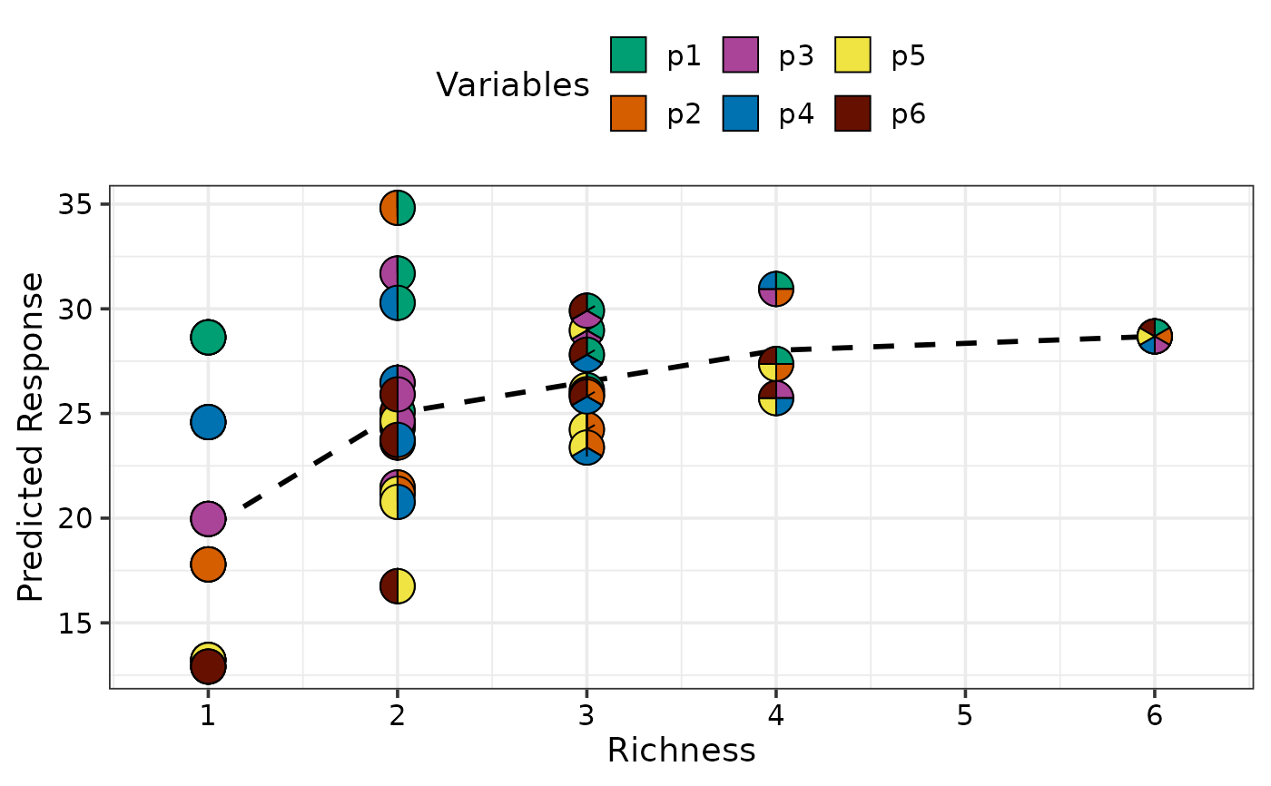
## By default response would be averaged on the basis of richness
plot_data <- gradient_change_data(data = sim4,
prop = c("p1", "p2", "p3",
"p4", "p5", "p6"),
model = mod)
#> ✔ Finished data preparation
## Create plot
gradient_change_plot(data = plot_data)
#> ✔ Created plot.
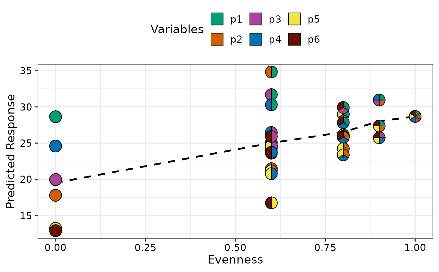
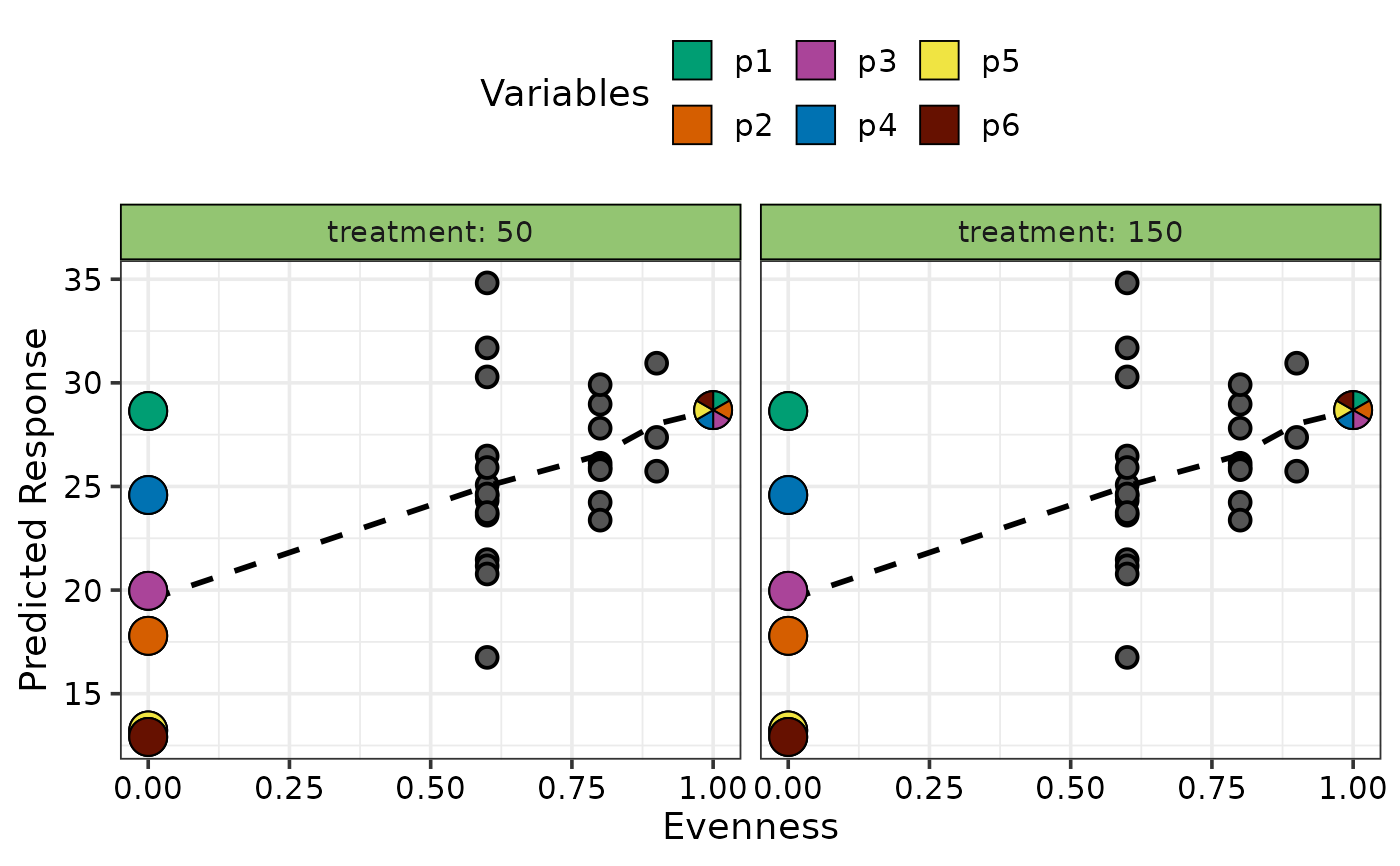
 ## Average response with respect to evenness
plot_data <- gradient_change_data(data = sim4,
prop = c("p1", "p2", "p3",
"p4", "p5", "p6"),
model = mod,
gradient = "evenness")
#> ✔ Finished data preparation
gradient_change_plot(data = plot_data)
#> ✔ Created plot.
## Average response with respect to evenness
plot_data <- gradient_change_data(data = sim4,
prop = c("p1", "p2", "p3",
"p4", "p5", "p6"),
model = mod,
gradient = "evenness")
#> ✔ Finished data preparation
gradient_change_plot(data = plot_data)
#> ✔ Created plot.
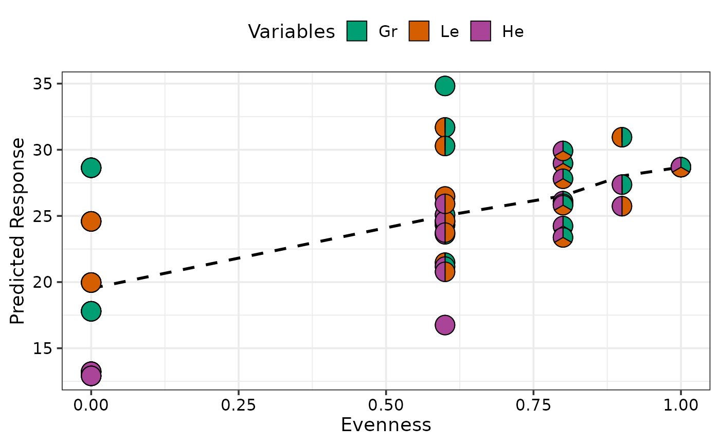
 ## Can also manually specify prop variables
## Add grouped proportions to data
plot_data <- group_prop(plot_data,
prop = c("p1", "p2", "p3", "p4", "p5", "p6"),
FG = c("Gr", "Gr", "Le", "Le", "He", "He"))
## Manually specify prop to show in pie-glyphs
gradient_change_plot(data = plot_data,
prop = c("Gr", "Le", "He"))
#> ✔ Created plot.
## Can also manually specify prop variables
## Add grouped proportions to data
plot_data <- group_prop(plot_data,
prop = c("p1", "p2", "p3", "p4", "p5", "p6"),
FG = c("Gr", "Gr", "Le", "Le", "He", "He"))
## Manually specify prop to show in pie-glyphs
gradient_change_plot(data = plot_data,
prop = c("Gr", "Le", "He"))
#> ✔ Created plot.
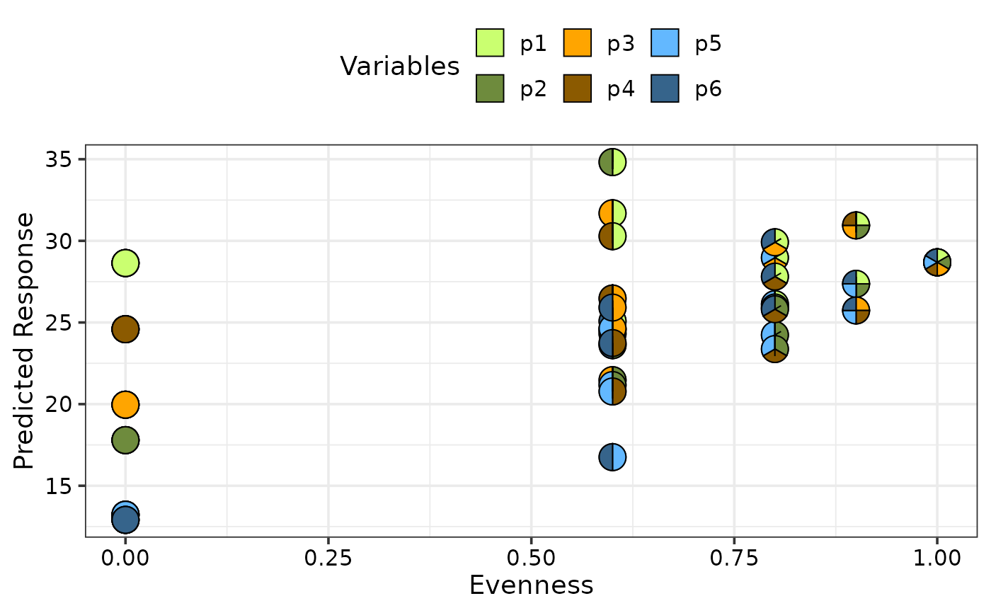
 ## Don't show line indicating the average change by using `average = FALSE` and
## Change colours of the pie-slices using `pie_colours`
gradient_change_plot(data = plot_data,
average = FALSE,
pie_colours = c("darkolivegreen1", "darkolivegreen4",
"orange1", "orange4",
"steelblue1", "steelblue4"))
#> ✔ Created plot.
## Don't show line indicating the average change by using `average = FALSE` and
## Change colours of the pie-slices using `pie_colours`
gradient_change_plot(data = plot_data,
average = FALSE,
pie_colours = c("darkolivegreen1", "darkolivegreen4",
"orange1", "orange4",
"steelblue1", "steelblue4"))
#> ✔ Created plot.
 ## Manually specify only specific communities to be shown as pie-chart
## glyphs using `pie_data`.
## Note: It is important for the data specified in
## `pie_data` to have the .Pred and .Gradient columns.
## So the best use case for this parameter is to accept
## a subset of the data specified in `data`.#'
## Also use `facet_var` to facet the plot on an additional variable
gradient_change_plot(data = plot_data,
pie_data = plot_data %>% filter(.Richness %in% c(1, 6)),
facet_var = "treatment")
#> ✔ Created plot.
## Manually specify only specific communities to be shown as pie-chart
## glyphs using `pie_data`.
## Note: It is important for the data specified in
## `pie_data` to have the .Pred and .Gradient columns.
## So the best use case for this parameter is to accept
## a subset of the data specified in `data`.#'
## Also use `facet_var` to facet the plot on an additional variable
gradient_change_plot(data = plot_data,
pie_data = plot_data %>% filter(.Richness %in% c(1, 6)),
facet_var = "treatment")
#> ✔ Created plot.
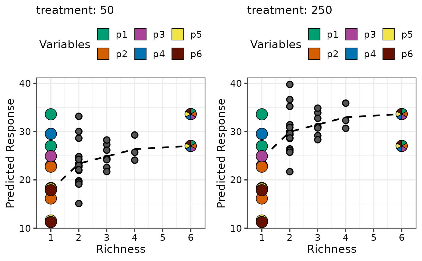
 ## If `add_var` was used during the data preparation step then
## multiple plots will be produced and can be arranged using nrow and ncol
# \donttest{
new_mod <- update(mod, ~. + treatment, data = sim4)
plot_data <- gradient_change_data(data = sim4[c(seq(1, 18, 3), 19:47), -2],
prop = c("p1", "p2", "p3",
"p4", "p5", "p6"),
model = new_mod,
add_var = list("treatment" = c(50, 250)))
#> ✔ Finished data preparation
## Create plot arranged in 2 columns
gradient_change_plot(data = plot_data,
pie_data = plot_data %>% filter(.Richness %in% c(1, 6)),
ncol = 2)
#> ✔ Created all plots.
## If `add_var` was used during the data preparation step then
## multiple plots will be produced and can be arranged using nrow and ncol
# \donttest{
new_mod <- update(mod, ~. + treatment, data = sim4)
plot_data <- gradient_change_data(data = sim4[c(seq(1, 18, 3), 19:47), -2],
prop = c("p1", "p2", "p3",
"p4", "p5", "p6"),
model = new_mod,
add_var = list("treatment" = c(50, 250)))
#> ✔ Finished data preparation
## Create plot arranged in 2 columns
gradient_change_plot(data = plot_data,
pie_data = plot_data %>% filter(.Richness %in% c(1, 6)),
ncol = 2)
#> ✔ Created all plots.
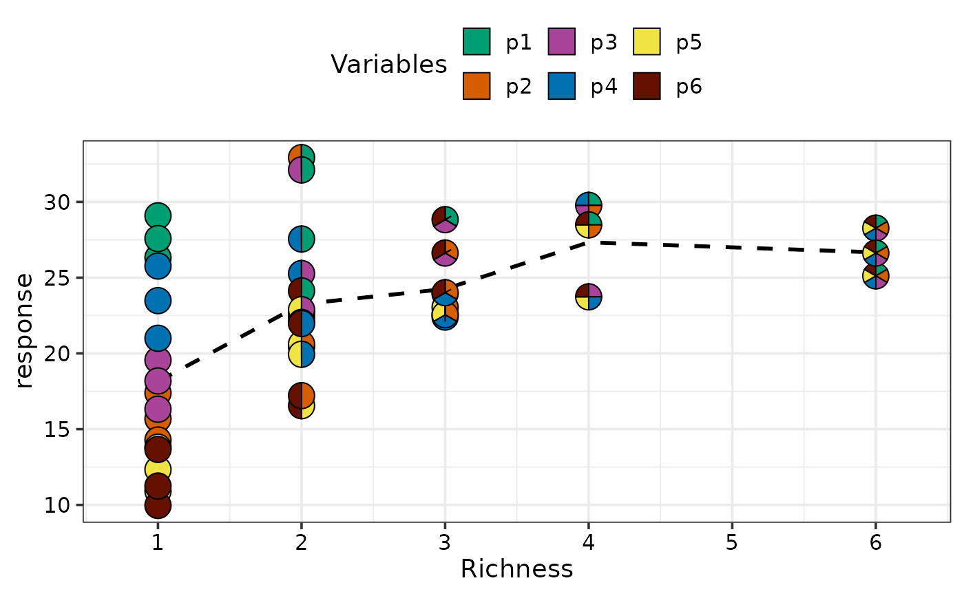
 ## Create plot for raw data instead of predictions
## Create the data for plotting by specifying `prediction = FALSE`
plot_data <- gradient_change_data(data = sim4[sim4$treatment == 50, ],
prop = c("p1", "p2", "p3",
"p4", "p5", "p6"),
prediction = FALSE)
#> ✔ Finished data preparation
## This data will not have any predictions
head(plot_data)
#> richness treatment p1 p2 p3 p4 p5 p6 response .Richness .Evenness .Gradient
#> 1 1 50 1 0 0 0 0 0 26.325 1 0 .Richness
#> 2 1 50 1 0 0 0 0 0 29.083 1 0 .Richness
#> 3 1 50 1 0 0 0 0 0 27.581 1 0 .Richness
#> 4 1 50 0 1 0 0 0 0 17.391 1 0 .Richness
#> 5 1 50 0 1 0 0 0 0 15.678 1 0 .Richness
#> 6 1 50 0 1 0 0 0 0 14.283 1 0 .Richness
## Call the plotting function by specifying the variable you we wish to
## plot on the Y-axis by using the argument `y_var`
## Since this data wasn't created using `gradient_change_data`
## `prop` should be manually specified
gradient_change_plot(data = plot_data, y_var = "response",
prop = c("p1", "p2", "p3",
"p4", "p5", "p6"))
#> ✔ Created plot.
## Create plot for raw data instead of predictions
## Create the data for plotting by specifying `prediction = FALSE`
plot_data <- gradient_change_data(data = sim4[sim4$treatment == 50, ],
prop = c("p1", "p2", "p3",
"p4", "p5", "p6"),
prediction = FALSE)
#> ✔ Finished data preparation
## This data will not have any predictions
head(plot_data)
#> richness treatment p1 p2 p3 p4 p5 p6 response .Richness .Evenness .Gradient
#> 1 1 50 1 0 0 0 0 0 26.325 1 0 .Richness
#> 2 1 50 1 0 0 0 0 0 29.083 1 0 .Richness
#> 3 1 50 1 0 0 0 0 0 27.581 1 0 .Richness
#> 4 1 50 0 1 0 0 0 0 17.391 1 0 .Richness
#> 5 1 50 0 1 0 0 0 0 15.678 1 0 .Richness
#> 6 1 50 0 1 0 0 0 0 14.283 1 0 .Richness
## Call the plotting function by specifying the variable you we wish to
## plot on the Y-axis by using the argument `y_var`
## Since this data wasn't created using `gradient_change_data`
## `prop` should be manually specified
gradient_change_plot(data = plot_data, y_var = "response",
prop = c("p1", "p2", "p3",
"p4", "p5", "p6"))
#> ✔ Created plot.
 # }
# }