DI specific wrapper of effects plot for compositional variables
visualise_effects.RdThis function will prepare the underlying data and plot the results for visualising
the effect of increasing or decreasing the proportion of a predictor variable
(from a set of compositional variables). The generated plot will
show a curve for each observation (whenever possible) in the data.
Pie-glyphs are
used to highlight the compositions of the specified communities and the ending
community after the variable interest either completes dominates the community
(when looking at the effect of increase) or completely vanishes from the community
(when looking at the effect of decrease) or both.
This is a wrapper function specifically for statistical models fit using the
DI() function from the
DImodels R package and would implicitly
call visualise_effects_data followed by
visualise_effects_plot. If your model object isn't fit using
DImodels, users can call the data and plot functions manually, one by one.
Usage
visualise_effects(
  model,
  data = NULL,
  var_interest = NULL,
  effect = c("increase", "decrease", "both"),
  add_var = list(),
  interval = c("confidence", "prediction", "none"),
  conf.level = 0.95,
  se = FALSE,
  average = TRUE,
  pie_colours = NULL,
  pie_radius = 0.3,
  FG = NULL,
  plot = TRUE,
  nrow = 0,
  ncol = 0
)
Arguments
- model
A Diversity Interactions model object fit by using the `
DI()` function from the `DImodels` package.- data
A dataframe specifying communities of interest for which user wants visualise the effect of species decrease or increase. If left blank, the communities from the original data used to fit the model would be selected.
- var_interest
A character vector specifying the variable for which to visualise the effect of change on the response. If left blank, all variables would be assumed to be of interest.
- effect
One of "increase", "decrease" or "both" to indicate whether to look at the effect of increasing the proportion, decreasing the proportion or doing both simultaneously, respectively on the response. The default in "increasing".
- add_var
A list specifying values for additional variables in the model other than the proportions (i.e. not part of the simplex design). This would be useful to compare the predictions across different values for a categorical variable. One plot will be generated for each unique combination of values specified here.
- interval
Type of interval to calculate:
- "none"
No interval to be calculated.
- "confidence" (default)
Calculate a confidence interval.
- "prediction"
Calculate a prediction interval.
- conf.level
The confidence level for calculating confidence/prediction intervals. Default is 0.95.
- se
A boolean variable indicating whether to plot confidence intervals associated with the effect of species increase or decrease
- average
A boolean value indicating whether to add a line describing the "average" effect of variable increase or decrease. The average is calculated at the median value of any variables not specified.
- pie_colours
A character vector indicating the colours for the slices in the pie-glyphs.
If left NULL, the colour blind friendly colours will be for the pie-glyph slices.- pie_radius
A numeric value specifying the radius (in cm) for the pie-glyphs. Default is 0.3 cm.
- FG
A higher level grouping for the compositional variables in the data. Variables belonging to the same group will be assigned with different shades of the same colour. The user can manually specify a character vector giving the group each variable belongs to. If left empty the function will try to get a grouping from the original
DImodel object.- plot
A boolean variable indicating whether to create the plot or return the prepared data instead. The default `TRUE` creates the plot while `FALSE` would return the prepared data for plotting. Could be useful for if user wants to modify the data first and then call the plotting function manually.
- nrow
Number of rows in which to arrange the final plot (when `add_var` is specified).
- ncol
Number of columns in which to arrange the final plot (when `add_var` is specified).
Value
A ggmultiplot (ggplot if single plot is returned) class object or data-frame (if `plot = FALSE`)
Examples
library(DImodels)
## Load data
data(sim1)
## Fit model
mod <- DI(prop = 3:6, DImodel = "AV", data = sim1, y = "response")
#> Fitted model: Average interactions 'AV' DImodel
## Get effects plot for all species in design
visualise_effects(model = mod)
#> • `var_interest` was not specified. Assuming all variables are of interest.
#> ✔ Finished data preparation.
#> ✔ Created plot.
 ## Choose a variable of interest using `var_interest`
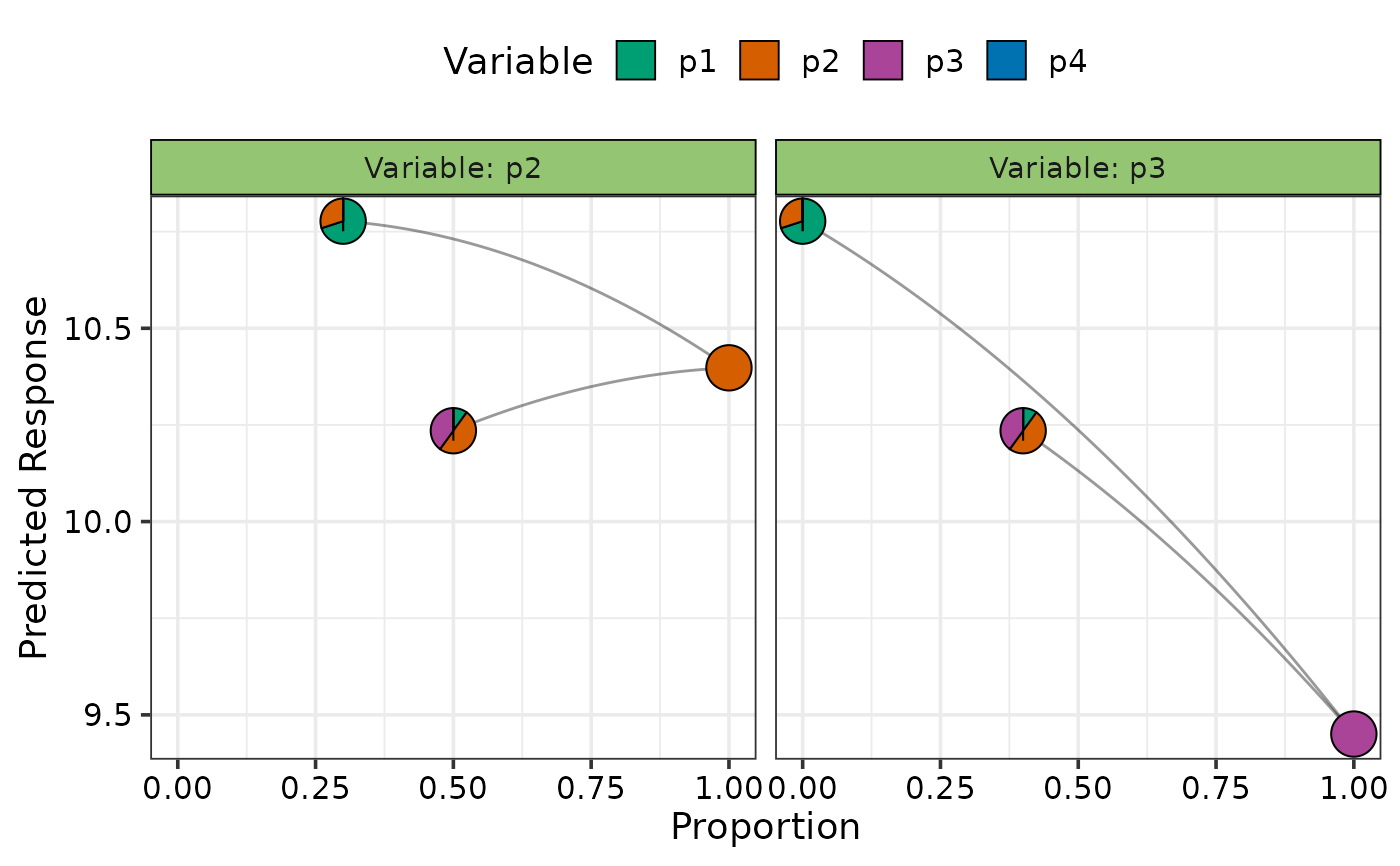
visualise_effects(model = mod, var_interest = c("p1", "p3"))
#> ✔ Finished data preparation.
#> ✔ Created plot.
## Choose a variable of interest using `var_interest`
visualise_effects(model = mod, var_interest = c("p1", "p3"))
#> ✔ Finished data preparation.
#> ✔ Created plot.
 ## Add custom communities to plot instead of design communities
## Any variable not specified will be assumed to be 0
## Not showing the average curve using `average = FALSE`
visualise_effects(model = mod, average = FALSE,
data = data.frame("p1" = c(0.7, 0.1),
"p2" = c(0.3, 0.5),
"p3" = c(0, 0.4)),
var_interest = c("p2", "p3"))
#> • The variable "p4" was not present in the data specified, assuming their
#> proportions to be 0.
#> ✔ Finished data preparation.
#> ✔ Created plot.
## Add custom communities to plot instead of design communities
## Any variable not specified will be assumed to be 0
## Not showing the average curve using `average = FALSE`
visualise_effects(model = mod, average = FALSE,
data = data.frame("p1" = c(0.7, 0.1),
"p2" = c(0.3, 0.5),
"p3" = c(0, 0.4)),
var_interest = c("p2", "p3"))
#> • The variable "p4" was not present in the data specified, assuming their
#> proportions to be 0.
#> ✔ Finished data preparation.
#> ✔ Created plot.
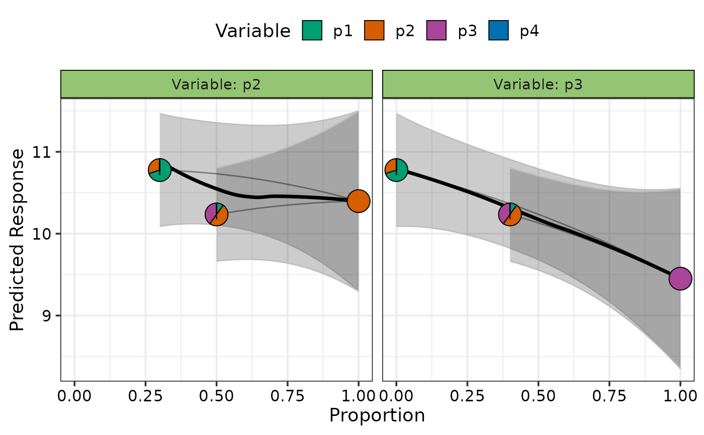
 ## Add uncertainty on plot
visualise_effects(model = mod, average = TRUE,
data = data.frame("p1" = c(0.7, 0.1),
"p2" = c(0.3, 0.5),
"p3" = c(0, 0.4)),
var_interest = c("p2", "p3"), se = TRUE)
#> • The variable "p4" was not present in the data specified, assuming their
#> proportions to be 0.
#> ✔ Finished data preparation.
#> ✔ Created plot.
## Add uncertainty on plot
visualise_effects(model = mod, average = TRUE,
data = data.frame("p1" = c(0.7, 0.1),
"p2" = c(0.3, 0.5),
"p3" = c(0, 0.4)),
var_interest = c("p2", "p3"), se = TRUE)
#> • The variable "p4" was not present in the data specified, assuming their
#> proportions to be 0.
#> ✔ Finished data preparation.
#> ✔ Created plot.
 ## Visualise effect of species decrease for particular species
## Show a 99% confidence interval using `conf.level`
visualise_effects(model = mod, effect = "decrease",
average = TRUE, se = TRUE, conf.level = 0.99,
data = data.frame("p1" = c(0.7, 0.1),
"p2" = c(0.3, 0.5),
"p3" = c(0, 0.4),
"p4" = 0),
var_interest = c("p1", "p3"))
#> ✔ Finished data preparation.
#> ✔ Created plot.
## Visualise effect of species decrease for particular species
## Show a 99% confidence interval using `conf.level`
visualise_effects(model = mod, effect = "decrease",
average = TRUE, se = TRUE, conf.level = 0.99,
data = data.frame("p1" = c(0.7, 0.1),
"p2" = c(0.3, 0.5),
"p3" = c(0, 0.4),
"p4" = 0),
var_interest = c("p1", "p3"))
#> ✔ Finished data preparation.
#> ✔ Created plot.
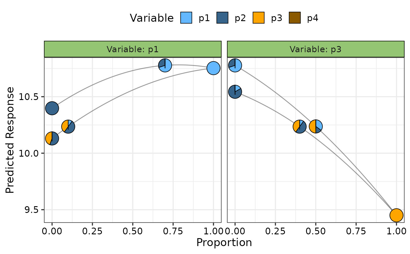
 ## Show effects of both increase and decrease using `effect = "both"`
## and change colours of pie-glyphs using `pie_colours`
visualise_effects(model = mod, effect = "both",
average = FALSE,
pie_colours = c("steelblue1", "steelblue4", "orange1", "orange4"),
data = data.frame("p1" = c(0.7, 0.1),
"p2" = c(0.3, 0.5),
"p3" = c(0, 0.4),
"p4" = 0),
var_interest = c("p1", "p3"))
#> ✔ Finished data preparation.
#> ✔ Created plot.
## Show effects of both increase and decrease using `effect = "both"`
## and change colours of pie-glyphs using `pie_colours`
visualise_effects(model = mod, effect = "both",
average = FALSE,
pie_colours = c("steelblue1", "steelblue4", "orange1", "orange4"),
data = data.frame("p1" = c(0.7, 0.1),
"p2" = c(0.3, 0.5),
"p3" = c(0, 0.4),
"p4" = 0),
var_interest = c("p1", "p3"))
#> ✔ Finished data preparation.
#> ✔ Created plot.
 # Add additional variables and create a separate plot for each
# \donttest{
visualise_effects(model = mod, effect = "both",
average = FALSE,
pie_colours = c("steelblue1", "steelblue4", "orange1", "orange4"),
data = data.frame("p1" = c(0.7, 0.1),
"p2" = c(0.3, 0.5),
"p3" = c(0, 0.4),
"p4" = 0),
var_interest = c("p1", "p3"),
add_var = list("block" = factor(c(1, 2),
levels = c(1, 2, 3, 4))))
#> ✔ Finished data preparation.
#> ✔ Created all plots.
# Add additional variables and create a separate plot for each
# \donttest{
visualise_effects(model = mod, effect = "both",
average = FALSE,
pie_colours = c("steelblue1", "steelblue4", "orange1", "orange4"),
data = data.frame("p1" = c(0.7, 0.1),
"p2" = c(0.3, 0.5),
"p3" = c(0, 0.4),
"p4" = 0),
var_interest = c("p1", "p3"),
add_var = list("block" = factor(c(1, 2),
levels = c(1, 2, 3, 4))))
#> ✔ Finished data preparation.
#> ✔ Created all plots.
 # }
## Specify `plot = FALSE` to not create the plot but return the prepared data
head(visualise_effects(model = mod, effect = "both",
average = FALSE, plot = FALSE,
pie_colours = c("steelblue1", "steelblue4",
"orange1", "orange4"),
data = data.frame("p1" = c(0.7, 0.1),
"p2" = c(0.3, 0.5),
"p3" = c(0, 0.4),
"p4" = 0),
var_interest = c("p1", "p3")))
#> ✔ Finished data preparation.
#> p1 p2 p3 p4 .Sp .Proportion .Group .Pred .Lower .Upper .Marginal
#> 1 0.000 1.000 0 0 p1 0.000 1 10.39773 9.297929 11.49753 0.9694331
#> 2 0.014 0.986 0 0 p1 0.014 1 10.41130 9.341016 11.48159 0.9519870
#> 3 0.028 0.972 0 0 p1 0.028 1 10.42463 9.382816 11.46645 0.9345409
#> 4 0.042 0.958 0 0 p1 0.042 1 10.43771 9.423328 11.45210 0.9170948
#> 5 0.056 0.944 0 0 p1 0.056 1 10.45055 9.462555 11.43855 0.8996487
#> 6 0.070 0.930 0 0 p1 0.070 1 10.46315 9.500501 11.42580 0.8822026
#> .Threshold .MarEffect .Effect
#> 1 0.784 Negative both
#> 2 0.784 Negative both
#> 3 0.784 Negative both
#> 4 0.784 Negative both
#> 5 0.784 Negative both
#> 6 0.784 Negative both
# }
## Specify `plot = FALSE` to not create the plot but return the prepared data
head(visualise_effects(model = mod, effect = "both",
average = FALSE, plot = FALSE,
pie_colours = c("steelblue1", "steelblue4",
"orange1", "orange4"),
data = data.frame("p1" = c(0.7, 0.1),
"p2" = c(0.3, 0.5),
"p3" = c(0, 0.4),
"p4" = 0),
var_interest = c("p1", "p3")))
#> ✔ Finished data preparation.
#> p1 p2 p3 p4 .Sp .Proportion .Group .Pred .Lower .Upper .Marginal
#> 1 0.000 1.000 0 0 p1 0.000 1 10.39773 9.297929 11.49753 0.9694331
#> 2 0.014 0.986 0 0 p1 0.014 1 10.41130 9.341016 11.48159 0.9519870
#> 3 0.028 0.972 0 0 p1 0.028 1 10.42463 9.382816 11.46645 0.9345409
#> 4 0.042 0.958 0 0 p1 0.042 1 10.43771 9.423328 11.45210 0.9170948
#> 5 0.056 0.944 0 0 p1 0.056 1 10.45055 9.462555 11.43855 0.8996487
#> 6 0.070 0.930 0 0 p1 0.070 1 10.46315 9.500501 11.42580 0.8822026
#> .Threshold .MarEffect .Effect
#> 1 0.784 Negative both
#> 2 0.784 Negative both
#> 3 0.784 Negative both
#> 4 0.784 Negative both
#> 5 0.784 Negative both
#> 6 0.784 Negative both