This example shows the use of PieGlyph package to replace
the points in a time series plot with pie charts showing the proportions
of different variables. Generally, time series plots don’t have an
aspect ratio of 1 as the width of the plot is very large compared to the
height. Due to this wide nature of time series plots previous attempts
at adding pie-charts to the plot resulted in the circular pie-charts
getting flattened into ellipses. This could be rectified by forcing the
user to make the plot have equal dimensions, however that caused more
problems as the resultant plots then became squashed between white
space. These issues rendered the plots uninterpretable.
The PieGlyph package attempts to solve this problem by
creating axis invariant pie-charts which wouldn’t get squashed into
ellipses and also wouldn’t get scaled along with the plot dimensions.
Load data
The data used for this example is the Seatbelts data which shows the monthly totals of car drivers and passengers killed or seriously injured from Jan 1969 to Dec 1984 in Great Britain.
Seatbelts <- data.frame(Seatbelts, time = time(Seatbelts))
head(Seatbelts)
#>   DriversKilled drivers front rear   kms PetrolPrice VanKilled law     time
#> 1           107    1687   867  269  9059   0.1029718        12   0 1969.000
#> 2            97    1508   825  265  7685   0.1023630         6   0 1969.083
#> 3           102    1507   806  319  9963   0.1020625        12   0 1969.167
#> 4            87    1385   814  407 10955   0.1008733         8   0 1969.250
#> 5           119    1632   991  454 11823   0.1010197        10   0 1969.333
#> 6           106    1511   945  427 12391   0.1005812        13   0 1969.417
For each month over the 15 years the variables
DriversKillled gives the number of car drivers killed,
drivers describes the number of car drivers killed or
seriously injured, front gives the number of front-seat
passengers killed or seriously injured and rear gives the
number of rear-seat passengers killed or seriously injured,
VanKilled contains the number of van (‘light goods
vehicle’) drivers killed, kms gives the number of
kilometers driven in the particular month while PetrolPrice
contains the price of petrol. Finally, law describes
whether or not it was compulsory to wear seat belts.
For the visualisation we’ll be using a subset of the Seatbelts data from Jan 1980 to Dec 1984.
plot_data <- Seatbelts[133:192, ]
head(plot_data)
#>     DriversKilled drivers front rear   kms PetrolPrice VanKilled law     time
#> 133           115    1665   748  306 14027   0.1037750         7   0 1980.000
#> 134            95    1361   593  263 14478   0.1071142         4   0 1980.083
#> 135            92    1506   720  323 16155   0.1073748        10   0 1980.167
#> 136           100    1360   646  310 16585   0.1116954         4   0 1980.250
#> 137            95    1453   765  424 18117   0.1106382         8   0 1980.333
#> 138           114    1522   820  403 17552   0.1118552         8   0 1980.417
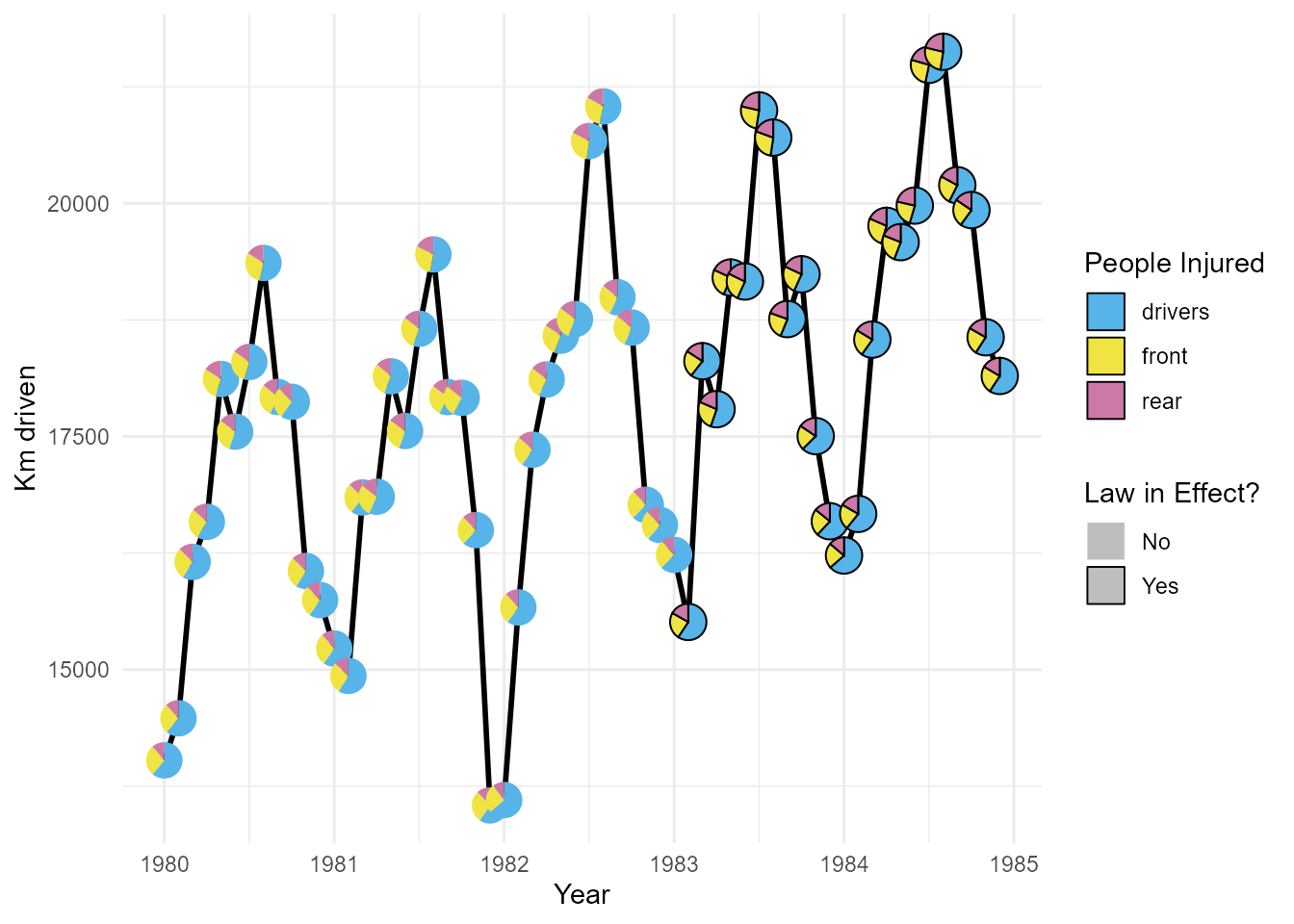
The number of kilometers driven in each month changes over time. It would be difficult to visualise this change over time whilst also showing the proportion of drivers/passengers injured over the time period using a simple time series plot. However, if we replace the points in the plot with pie-charts we can simultaneously visualise both the distance traveled and the proportion of injuries over time.
Create Plots
Problems with existing techniques
Create a pie-chart plot for the Seatbelts data using the
scatterpie R package.
p <- ggplot(plot_data, aes(x = time, y = kms))+
        geom_line(linewidth = 1)+
        geom_scatterpie(aes(x = time, y = kms),
                        colour = 'black',
                        data = plot_data,
                        cols = c('drivers','front', 'rear'))+
        theme_minimal()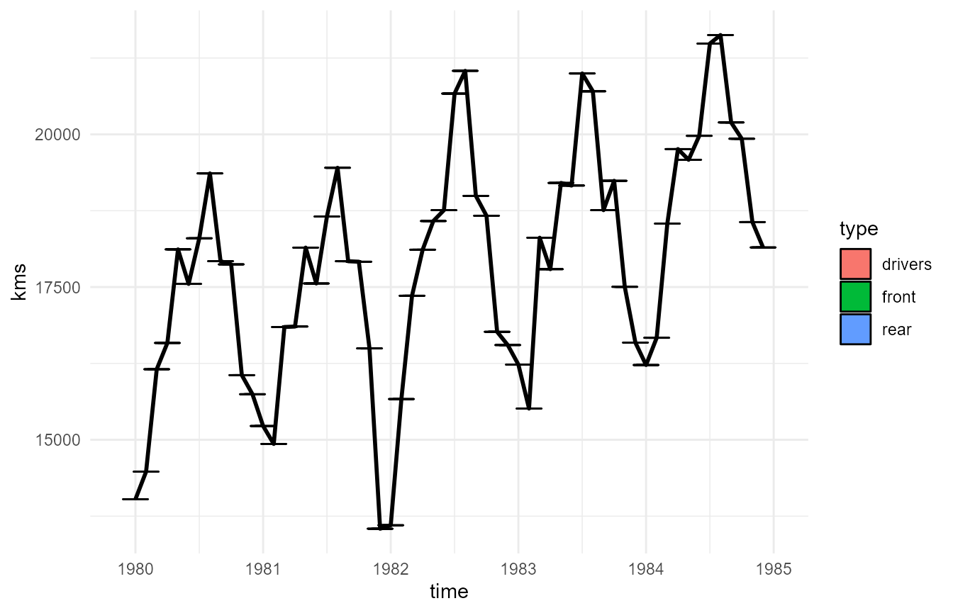
As mentioned before the pie-charts are squished due to the wide nature of the plot and are illegible.
Using coord_fixed() to fix the plot dimensions worsens the
problem further and renders the plot unintelligible.
p + coord_fixed()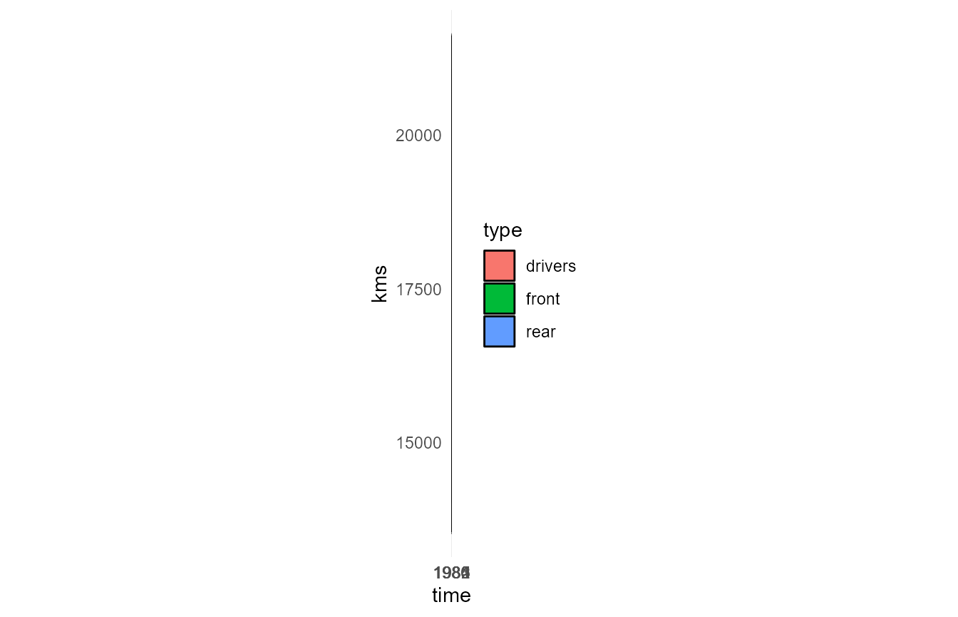
Fixing the problems using PieGlyph
PieGlyph fixes this problem by creating the pie charts independently of the plot axes and thus the plot dimensions have no effects on the pie charts
pl <- ggplot(plot_data, aes(x = time, y = kms))+
        # Add the lines joining the pie-charts
        geom_line(linewidth = 1)+
        # Add pie-chart showing proportion of people injured
        geom_pie_glyph(colour = 'black',
                       slices = c('drivers', 'front', 'rear'))+
        # Change theme of plot
        theme_minimal()
pl 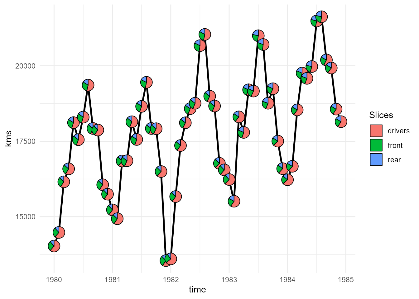
We can also highlight the months where the seatbelt law was in effect, by mapping them to the pie-borders.
pl <- ggplot(plot_data, aes(x = time, y = kms))+
        # Add the lines joining the pie-charts
        geom_line(linewidth = 1)+
        # Add pie-chart showing proportion of people injured
        # Also map the pie-borders to show whether seatbelt law was present
        geom_pie_glyph(aes(linetype = as.factor(law)),
                       colour = 'black',
                       slices = c('drivers', 'front', 'rear'))+
        # Adjust the style of borders
        scale_linetype_manual(values = c(0, 1),
                              labels = c('No', 'Yes'))+
        # Plot theme
        theme_minimal()
pl 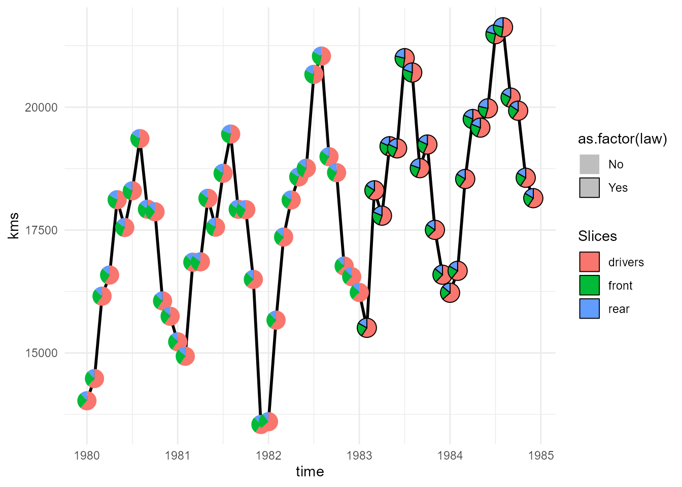
We can then adjust any aesthetics of our choice in the plot using the usual ggplot functions.
pl +
  # Colours of the pie-sectors
  scale_fill_manual(values = c('#56B4E9','#F0E442','#CC79A7'))+
  # Axis and legend titles
  labs(x = 'Year', y = 'Km driven',
       fill = 'People Injured', linetype = 'Law in Effect?')