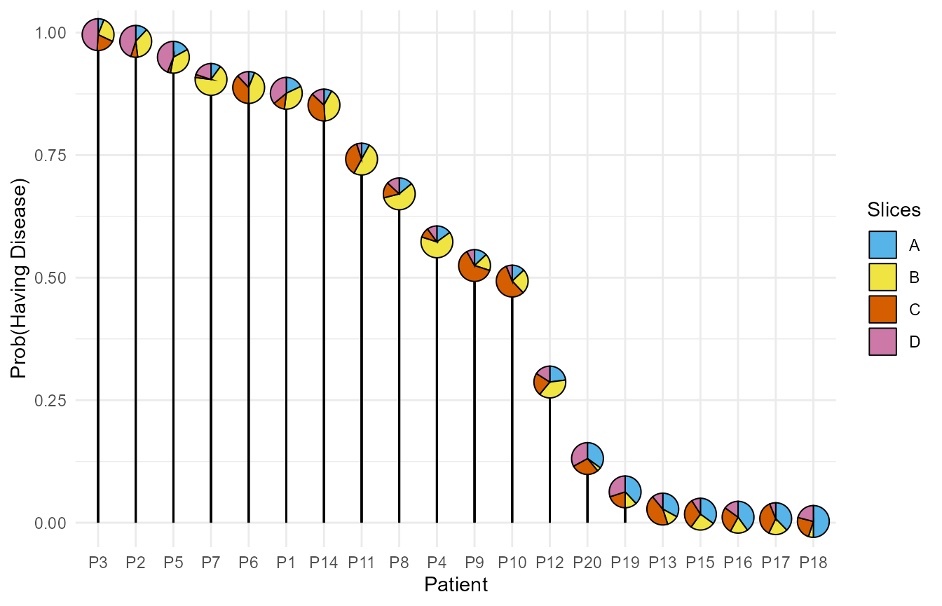
This example shows the use of PieGlyph package to create
lollipop plots where the centre of the lollipop is replaced by a
pie-chart showing proportion of different attributes.
This examples highlights that proportions or percentages are not required for the attribute values in the raw data; the package will take counts or other attribute values and automatically convert them to proportions to generate the graph. Further, the attributes don’t always have to be in separate columns, they can also be stacked in one column with their corresponding values in another column.
Create fake data
model_data <- data.frame('ID' = paste0('P', 1:20),
                         'A' = c(90, 60, 30, 75, 85,
                                 30, 50, 70, 65, 65,
                                 40, 115, 165, 40, 175,
                                 200, 185, 250, 190, 175),
                         'B' = c(170, 180, 130, 325, 180,
                                 220, 335, 285, 85, 125,
                                 250, 190, 60, 205, 125,
                                 90, 95, 25, 60, 20),
                         'C' = c(60, 35, 95, 50, 15,
                                 190, 15, 80, 310, 280,
                                 185, 115, 220, 190, 155,
                                 135, 180, 120, 100, 140),
                         'D' = c(180, 225, 245, 50, 220,
                                 60, 100, 65, 40, 30,
                                 25, 80, 55, 65, 45,
                                 75, 30, 105, 150, 165),
                         'Disease' = factor(c(rep(c('Yes'), 10),
                                              rep(c('No'), 10))))
The data contains proportions of four protein markers in the blood for
20 different patients. ID is a unique identifier for each
patients while columns A, B, C,
and D describe the scores of each patient across the four
markers and disease describes whether of not the patient
has a disease.
head(model_data)
#>   ID  A   B   C   D Disease
#> 1 P1 90 170  60 180     Yes
#> 2 P2 60 180  35 225     Yes
#> 3 P3 30 130  95 245     Yes
#> 4 P4 75 325  50  50     Yes
#> 5 P5 85 180  15 220     Yes
#> 6 P6 30 220 190  60     Yes
Fit logistic regression model
We fit a logistic regression model with no intercept using the four protein markers as predictors for the probability of having the disease.
The model summary shows that marker A is significant in
predicting the probability of having the disease.
summary(m1)
#>
#> Call:
#> glm(formula = Disease ~ 0 + A + B + C + D, family = binomial(link = "logit"),
#>     data = model_data)
#>
#> Coefficients:
#>    Estimate Std. Error z value Pr(>|z|)
#> A -0.035561   0.018041  -1.971   0.0487 *
#> B  0.005089   0.004897   1.039   0.2987
#> C  0.003451   0.005785   0.597   0.5508
#> D  0.022697   0.015913   1.426   0.1538
#> ---
#> Signif. codes:  0 '***' 0.001 '**' 0.01 '*' 0.05 '.' 0.1 ' ' 1
#>
#> (Dispersion parameter for binomial family taken to be 1)
#>
#>     Null deviance: 27.726  on 20  degrees of freedom
#> Residual deviance: 13.221  on 16  degrees of freedom
#> AIC: 21.221
#>
#> Number of Fisher Scoring iterations: 6
Model predictions
We can now predict the probability of a patient having the disease give their scores on the four protein markers.
After making the predictions, the data is sorted in descending order of the probability of having the disease. Further the marker columns are stacked together into one column.
plot_data <- model_data %>%
  # Add predictions
  mutate('prediction' = predict(m1, type = 'response')) %>%
  # Sort in descending order of prediction
  arrange(desc(prediction)) %>%
  # Relevel ID for plotting in descending order
  mutate(ID = fct_inorder(ID)) %>%
  # Stack the four markers in one column
  pivot_longer(cols = c('A', 'B', 'C','D'), names_to = 'Marker',
               values_to = 'Proportion')

head(plot_data, 8)
#> # A tibble: 8 × 5
#>   ID    Disease prediction Marker Proportion
#>   <fct> <fct>        <dbl> <chr>       <dbl>
#> 1 P3    Yes          0.996 A              30
#> 2 P3    Yes          0.996 B             130
#> 3 P3    Yes          0.996 C              95
#> 4 P3    Yes          0.996 D             245
#> 5 P2    Yes          0.982 A              60
#> 6 P2    Yes          0.982 B             180
#> 7 P2    Yes          0.982 C              35
#> 8 P2    Yes          0.982 D             225
Bar plot
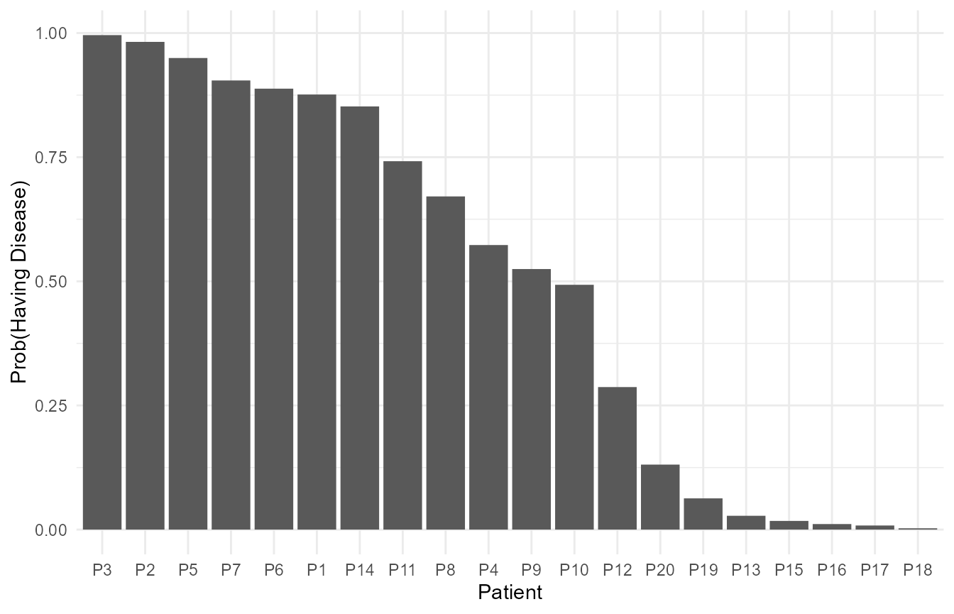
The probability of each patient in our sample having the disease can be visualised with a bar chart as follows.
# Filtering the data as each prediction is replicated 4 times, once for each marker
ggplot(data = filter(plot_data, Marker == 'A'))+
  geom_col(aes(x = ID, y = prediction))+
  # Add axis titles
  labs(y = 'Prob(Having Disease)', x = 'Patient')+
  theme_minimal()
Lollipop plot with pie-charts
The bar plot is not that useful in this example as it gives only the probability of having the disease and gives no information about the model predictors (scores for protein markers in this case).
We can improve this plot by converting it into a lollipop plot where the centre of the lollipop shows the proportions of the four protein markers. This enables us to view both, the response as well as the predictors for model simultaneously.
ggplot(data = plot_data, aes(x = ID, y = prediction, fill = Marker))+
  # Vertical line of lollipop
  geom_segment(aes(yend = 0, xend = ID))+
  # Pies-charts at the centre of the lollipop
  geom_pie_glyph(slices = 'Marker', values = 'Proportion',
                 radius = 0.3, colour = 'black')+
  # Axis titles
  labs(y = 'Prob(Having Disease)', x = 'Patient')+
  # Colours for sectors of the pie-chart
  scale_fill_manual(values = c('#56B4E9','#F0E442',
                               '#D55E00','#CC79A7'))+
  theme_minimal()
